One post to make it all, the summer vacation in Finland!

Where to start?

I guess day “0”, departure day, going to the boat on the 18th of July.
The day before I took my bike to work and left it in the garage (it’s 5 min from the harbor), and being by the check in 06:10 am was a little to early biking for my taste, plus the first tube to work gave me 15 min of “to be late” time.
Thankfully it all went well, I got to the boat in time!

waitingforboatbreakfast
Waiting in line to get on the boat in värtahamnen. then the breakfast on the boat!

waitingofboat
The wait to get of the boat has started! in Turku now..

I got of the boat and met my brotherinlaw Hannu, then we headed to our hotel

_DSC3307_DSC3310
Two pictures Hannu “snapped” of me on the way from the harbor to our hotel.

Our hotel of choice was Omena, pretty much in the middle of Turku, nothing fancy, but good space, large TV and fairly cheap!

omenastorage
Our two stallions in a corner at our hotel, ready for the abusive loading of gear.

Pretty much straight from the hotel check in we went to meet a friend of mine,Esa aka Bellina.
_DSC3321
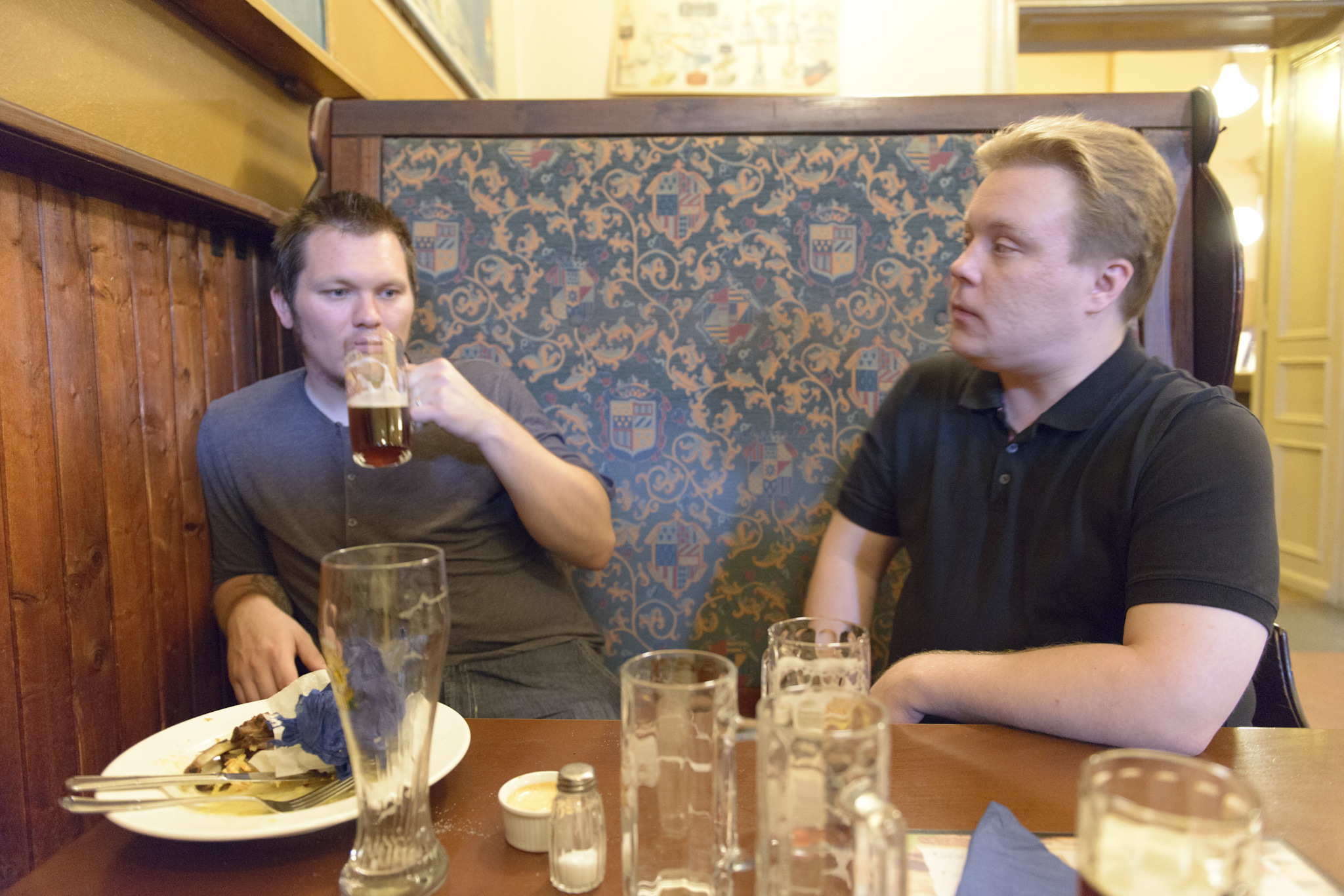
 The one they call Bellina and me at Panimoravintola Koulu some kind of meatserving brewery, nice food and beer!

From there we went to a pub, had a few more pints before heading back to sleep!

Day 1 – The first one of our epic two days Tour the Finland on the Kings road!

Well the day started early, breakfast at Subways around 0800 before a quick stop by Turun linna (the castle in Turku)


_DSC3332 _DSC3328
Me in front of Turun linna to the left and both of us in front of it to the right.

From the castle we went towards Salo, which would be our halfway stop for the day!
The roads where 90% bike roads, and rather country side-ish.

_DSC3336 _DSC3340
We had a little rain on our way out of Turku, didn’t stop Hannu from bringing out his Nikon, or lending it to me!

_DSC3346 _DSC3347
We found our Sign, it says Kings Road in Finish and Swedish!

_DSC3353  _DSC3367
At some point towards Salo we took a turn of the main road (I think it was the 51 or something) and ended up in what was more or less our own road (I think we met three cars in 15-20km)


_DSC3349_DSC3374
 
Complementary pictures of dramatic skies or something, it rained far away, then we hit the rain, the things that happen when you bike with a photo-nerd!

Anyway, roughly 60 km and many hours later, we found Salo! where I bought an new mini-pump (that broke a week later), before heading to get lunch!
_DSC3383
 
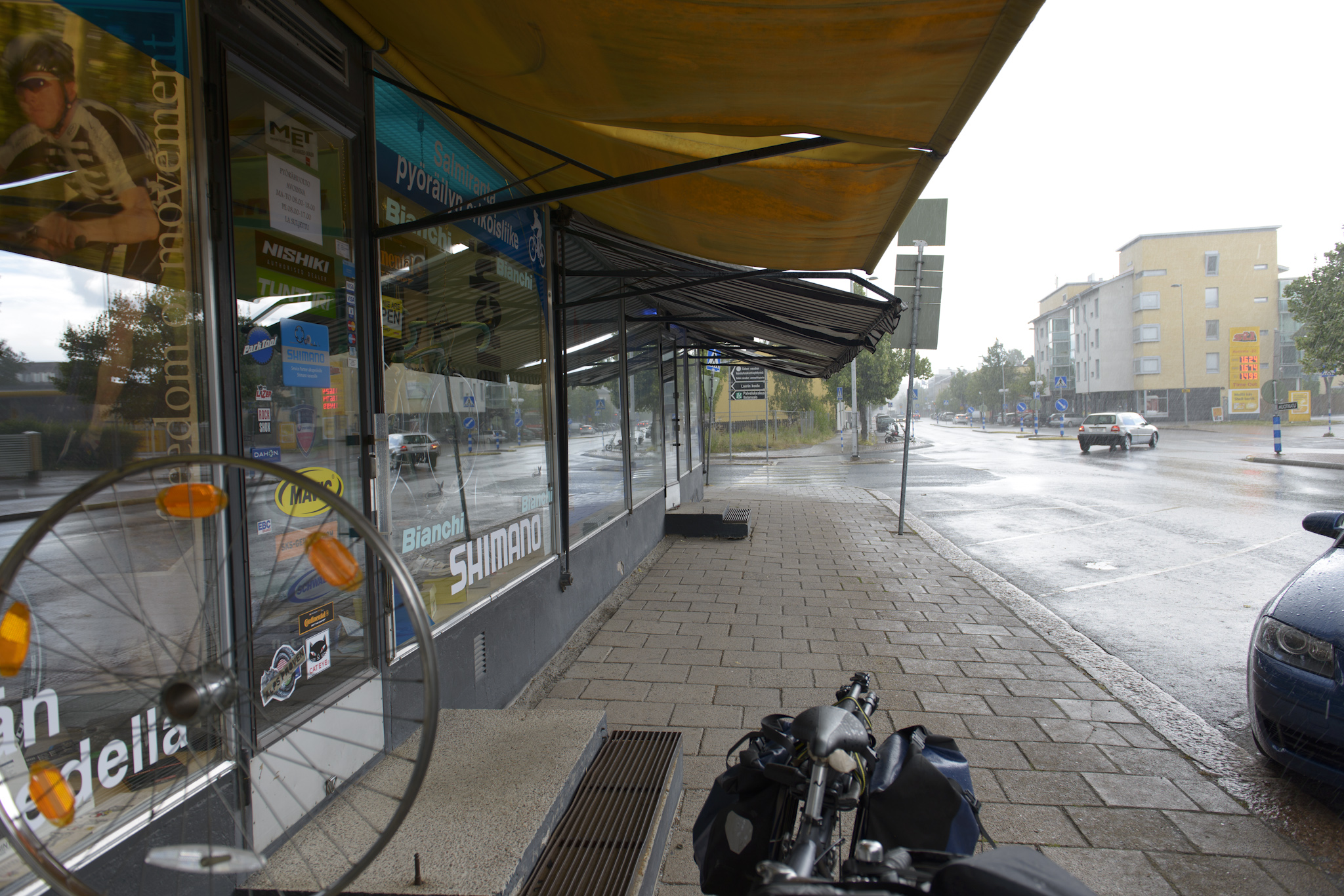
Said bikestore where I bought my pump, it started raining badly here.
20130719_133904 _DSC3395
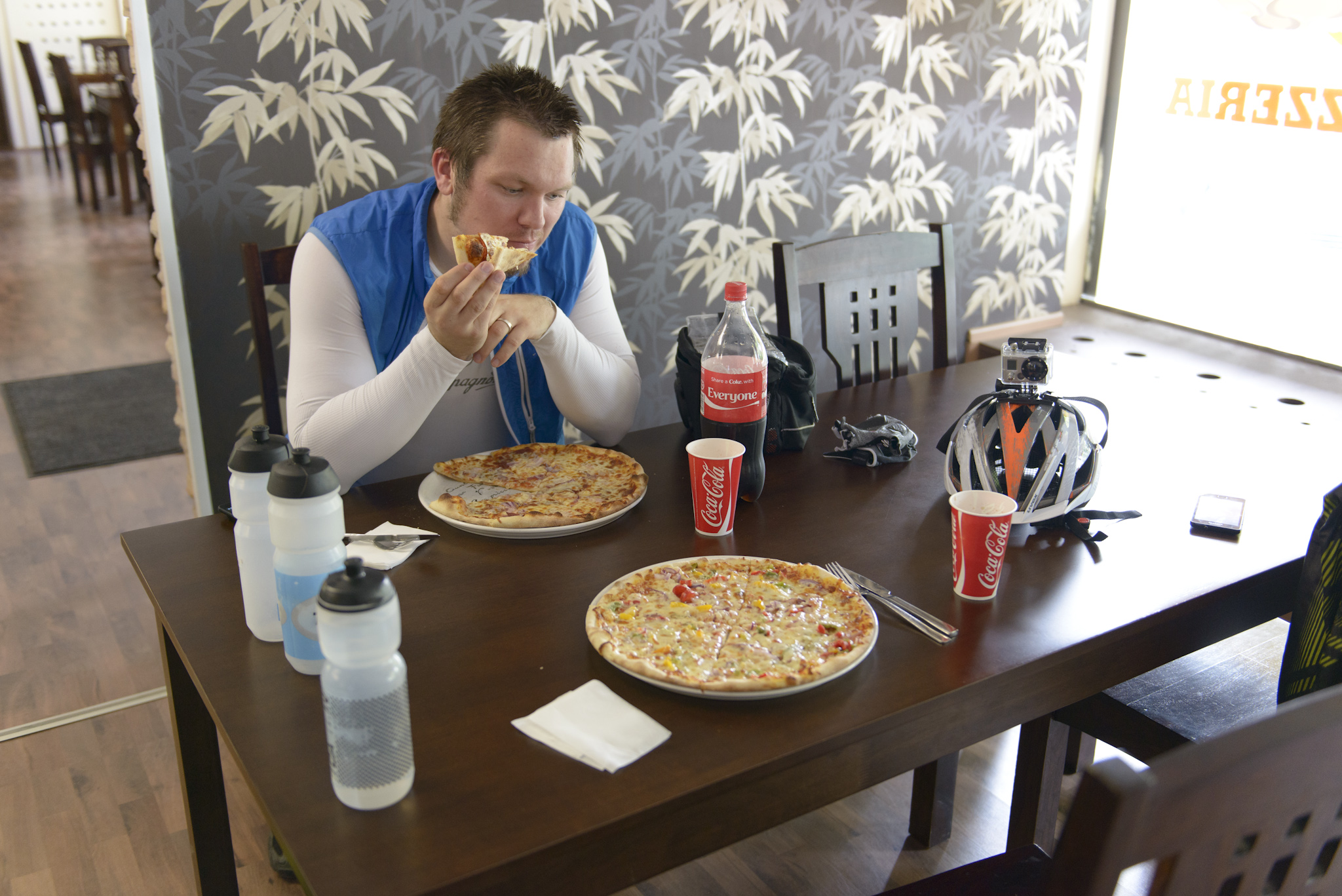
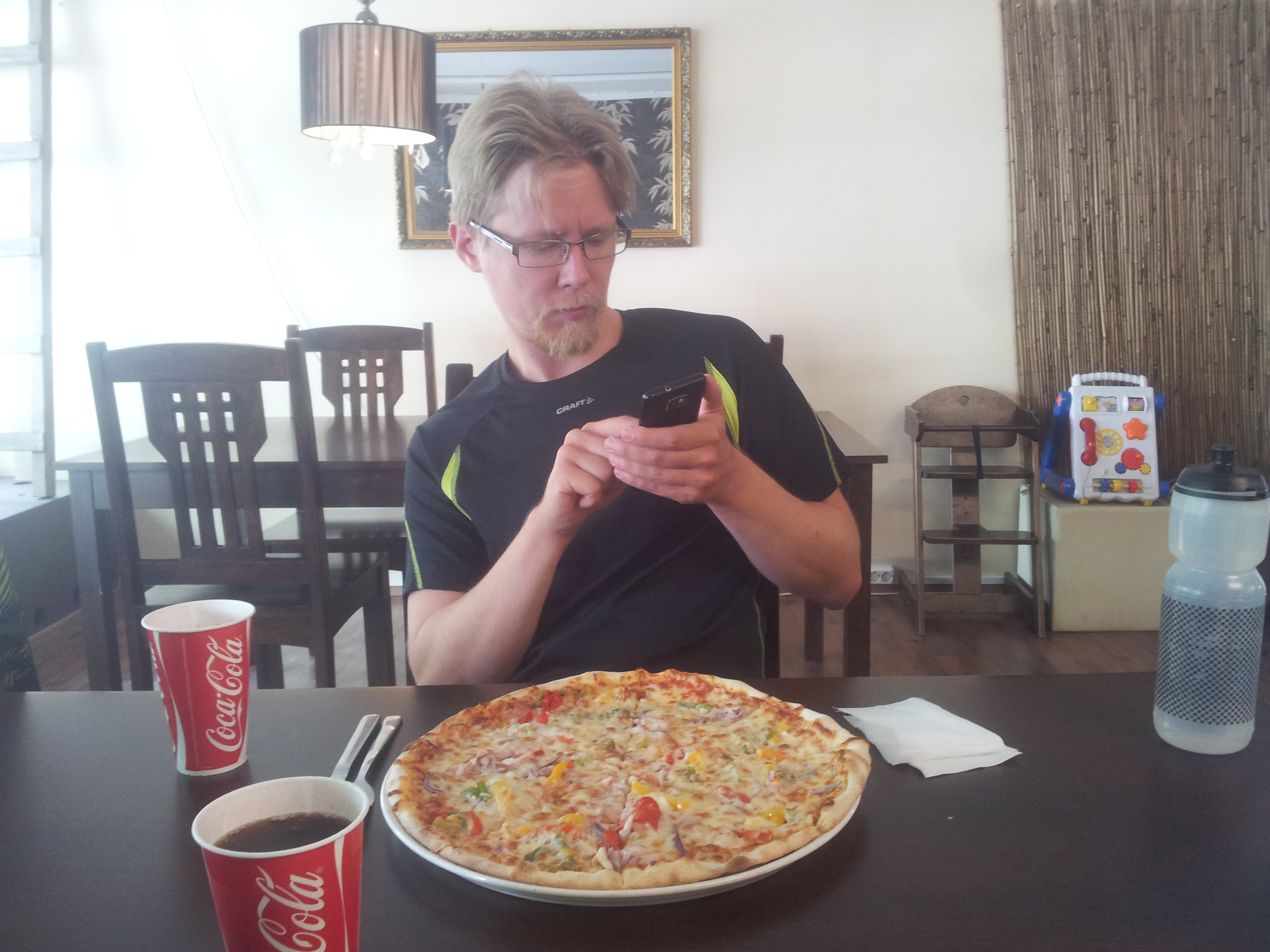
Pizza time, we stopped at “Smiley face” pizza or something like that,I had a bacon something pizza, Hannu had something vegetarian.

_DSC3397
Again with some artsy pictures from Hannu, my Uvex helmet with the go pro on it..

From Salo we headed south towards Tammisaari, fairly uneventful, abit of a changing weather, we did help out to “save” some horses, have a stop in Teijo


_DSC3399 _DSC3404
Said horse that was trying to runaway, and the reason we stopped, to photo this magnificent stable building!

_DSC3424
We had more rain on the way, here from outside a farms hedge, gave nice cover while we waited for the worst to pass!

_DSC3440_DSC3437
My bike leaning against a tree somewhere, during one of the “nature calls” breaks, the right was a church on the way in to Tammisaari (Tenhola I think).

We found our motel fairly late, I think between 1900 and 2000, but it was ok, plan was to walk around a bit, have some food, a few beers, maybe take sauna before bedtime.
Everything but sauna went as planned, sauna was booked for next morning, after breakfast.

_DSC3442 _DSC3443
 
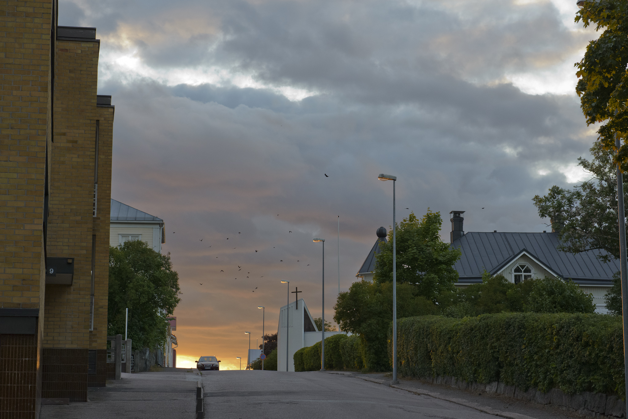
Some mode pictures from Tammisaari, beautiful town by the sea.

_DSC3448 _DSC3463
Another mode shot, this time of the church tower in Tammisaari, and just a little shot to show how dirty our bikes got!
_DSC3459
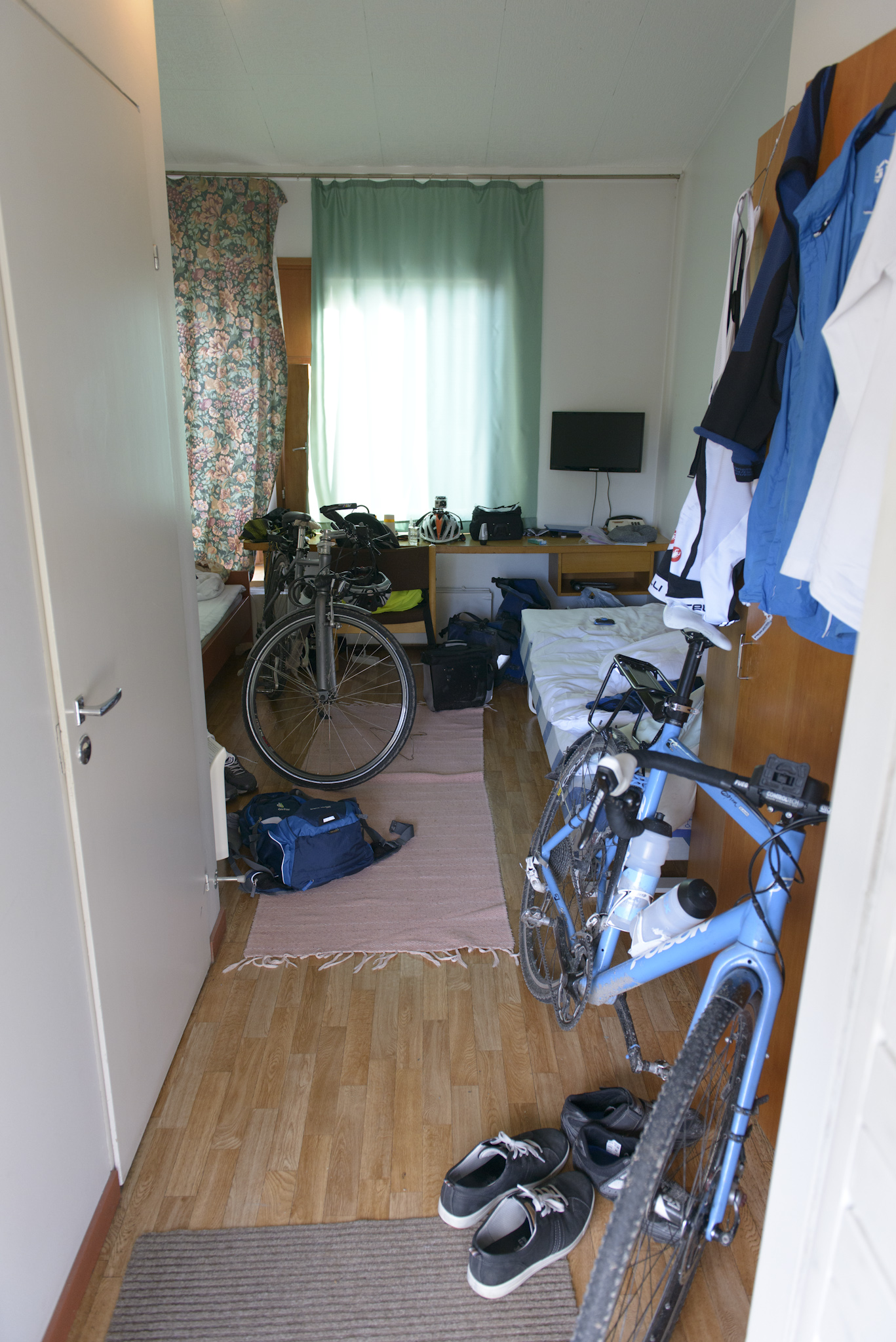
Not the biggest of rooms, but we fit everything inside, our rooms was at “Motel Marine”

At the end of the day, this was where we biked:

Day 2 – Two tired men go from Tammisaari to Helsinki

So, Saturday morning, breakfast “continental light” style, that’s no bacon for me and on top of that the people at the motel forgot to put on the sauna, so no sauna either, well early start for us then!

_DSC3467
Posing on a beach in Tammisaari, the morning of day 2

The original plan for today included a trip to Fiskars, but after a really long discussion (or one minute talk) we decided not to go “all the way up there” and instead went a different route that took us past Raseborg Castle


_DSC3468 _DSC3470
Hannu and me outside of the castle and the castle from another angle, cool castle atleast!

_DSC3485 _DSC3497
Me and Hannu on the inside of the castle, nice lighting from the windows and stuff.

_DSC3491  _DSC3500
 
Two pictures of the inner courtyard of the castle.

From Raseborg we headed toward Helsinki via Inkoo and Kirkkunummi, where we had a coffee break and our lunch, before heading via Espoo, Leppävaara to eastern Helsinki.
_DSC3509

20130720_125655 _DSC3510
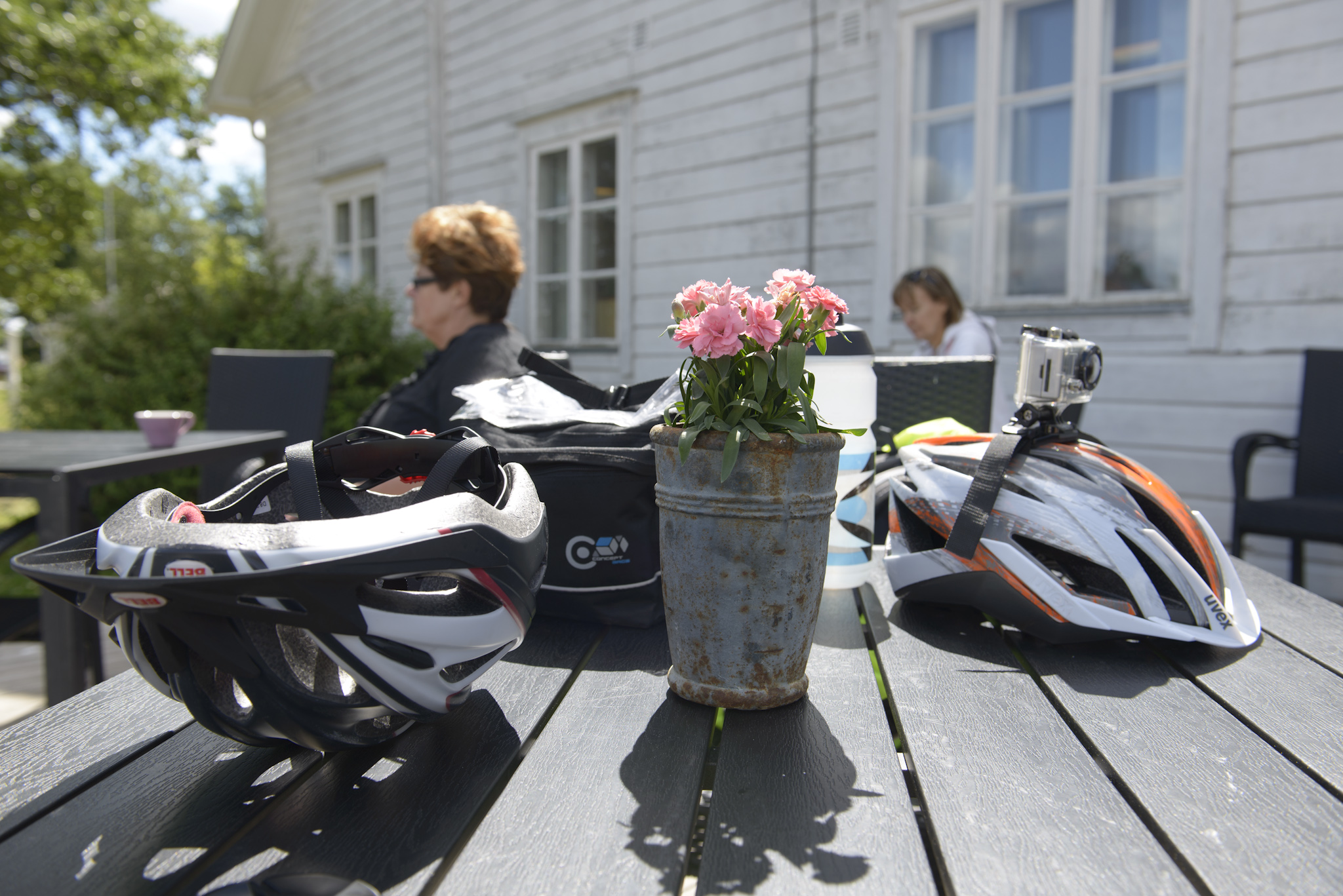
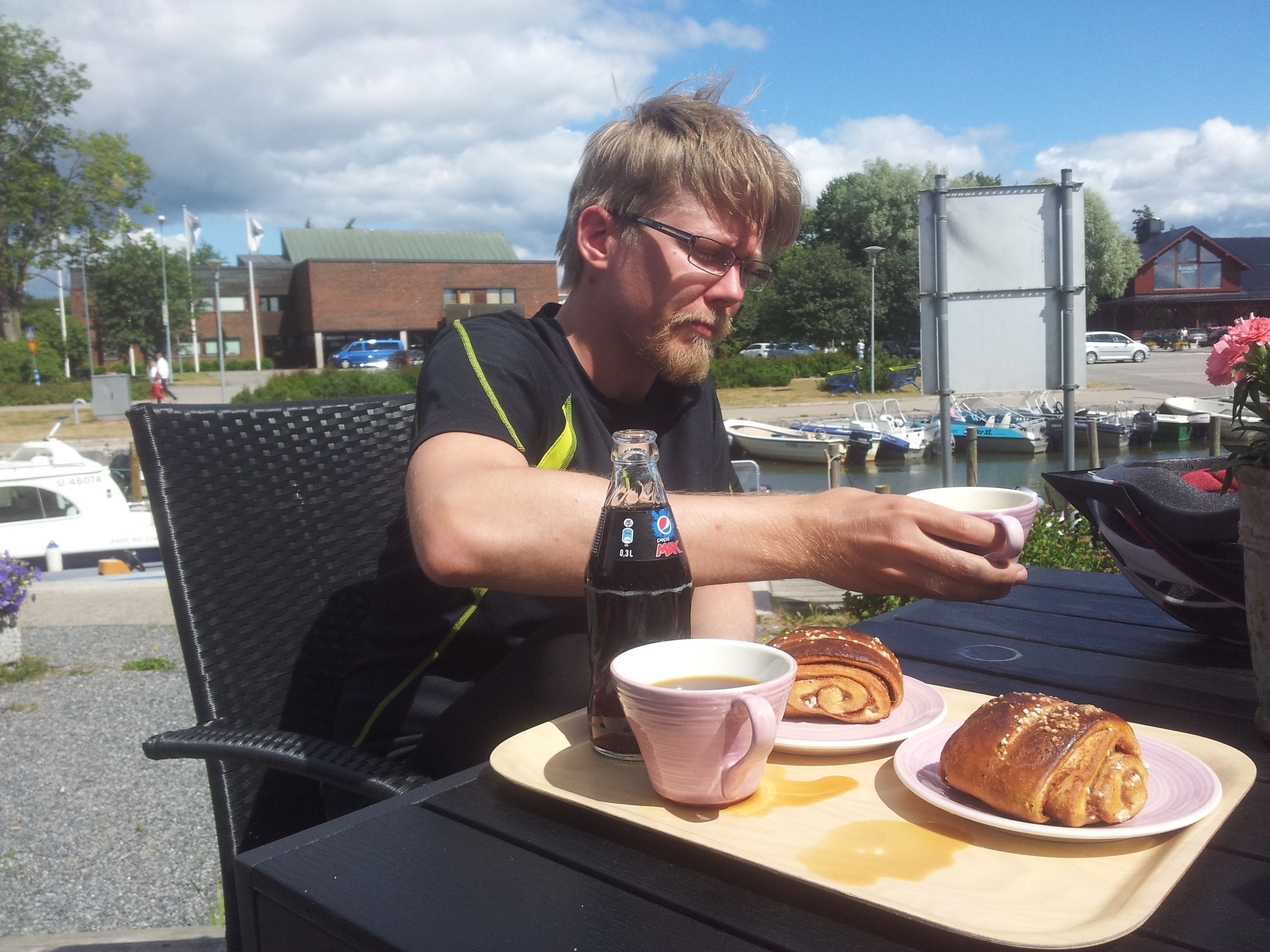
Some pictures from our “fika” in Inkoo.
_DSC3511
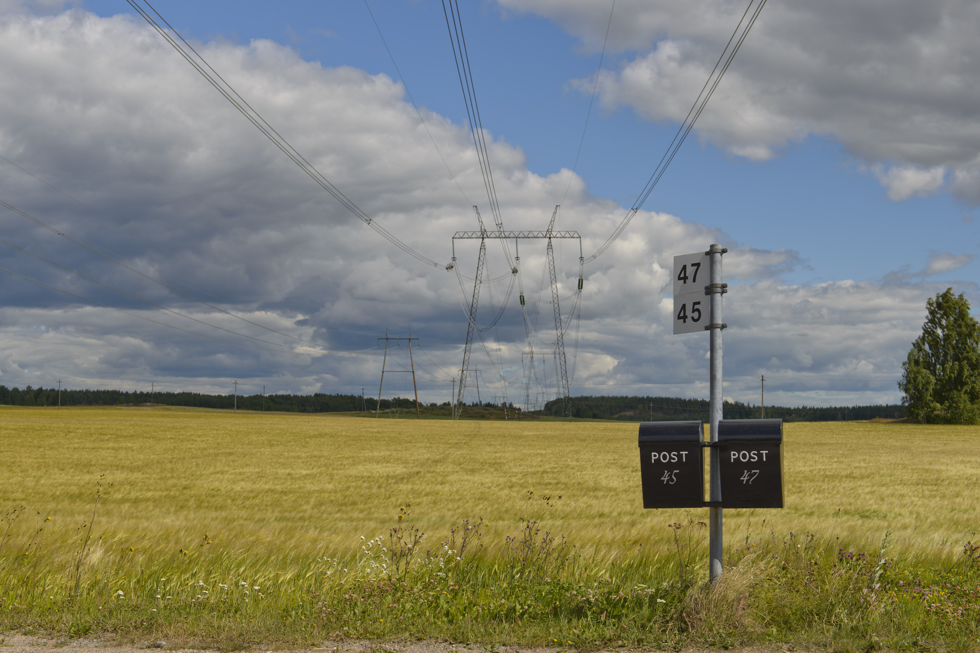
Random mailboxes on one of the roads, think it’s somewhere between Inkoo and Kirkkunummi, a lot of what we saw on our trip was similar landscape/scenery.

_DSC3539
Home at last  well at least at our end destination, being greeted by one happy little girl, my little princess <3

The GPS file from our trip this day:

The rest of the Finland trip, starting with a exploration ride of almost 90 km.

Well I did spend nearly two weeks in Finland, sadly I got problems with a tooth, had to go on antibiotics and then pull said tooth.

Anyway, I did get a few days of biking in before and after it!
The first trip I did a few days after finishing the Kings Road ride


The plan was to CX in Sipoonkorpi, unfortunately I ended up abit wrong compared to what I hoped and I only found some skiing place, filled up with soft and soggy sawdust, well since my mom was in Helsinki, I figured I’d turn around and go see if she had time!


20130723_122016 20130723_124844
The only two pictures I took on this trip, the Norwegian Kings Ship K/S Norge and a nice view by the beaches of Eiranranta.

After a quick Milkshake at McD with mom and one of her co-workers I headed for Sipoo to meet my lovely wife!

Photo session time! yes you read it right, I shall model a little (sort of)

Well it was decided that I was going to get some action shots of me biking, and Hannu agreed to bring his camera, flashes and softbox out in to the forest to photo.

Anyway, 4 hours later we had something like 62 pictures, here are some of them:

_DSC3863
The flying Norwegian, effect achieved by having the photographer lying in the ditch with me jumping on the wooden bridge.

_DSC3776 _DSC3783
Full focus ahead, picture on is the place leading to where I jump of on picture number two.

_DSC3843
The photographer wanted a picture with the view that I can only describe as a little peeping Tom or something…


_DSC3885 _DSC3890
Two pictures where we played with shutter speed and flashes to get some ghost trails.

The trial of GoPro’ing

I got to borrow a GoPro hero2 from Hannu, after a few tries, some cheezy editing of the movie, this is the result:


All the music in this movie is from www.beatpick.com

beatpick com-tag-trasp

Thats it for my vacation, who knows what will happen next time!

8,909 thoughts on “One post to make it all, the summer vacation in Finland!

  1. Прогон сайта с использованием программы “Хрумер” – это способ автоматизированного продвижения ресурса в поисковых системах. Этот софт позволяет оптимизировать сайт с точки зрения SEO, повышая его видимость и рейтинг в выдаче поисковых систем.

    Хрумер способен выполнять множество задач, таких как автоматическое размещение комментариев, создание форумных постов, а также генерацию большого количества обратных ссылок. Эти методы могут привести к быстрому увеличению посещаемости сайта, однако их надо использовать осторожно, так как неправильное применение может привести к санкциям со стороны поисковых систем.

    Прогон сайта “Хрумером” требует навыков и знаний в области SEO. Важно помнить, что качество контента и органичность ссылок играют важную роль в ранжировании. Применение Хрумера должно быть частью комплексной стратегии продвижения, а не единственным методом.

    Важно также следить за изменениями в алгоритмах поисковых систем, чтобы адаптировать свою стратегию к новым требованиям. В итоге, прогон сайта “Хрумером” может быть полезным инструментом для SEO, но его использование должно быть осмотрительным и в соответствии с лучшими практиками.

  2. ->>>>>>>>>>>>>заговор на любовь мужчины на соль читать белая магия<<<<<<<<<-
    ______________как влюбить в себя мужчину на всю жизнь и успешно выйти замуж заговор _____________

    https://privorot4.wordpress.com

    приворот парня на свечи, а также:

    ->>>>>>после снятие приворота мужа
    ->>>>>>белая магия на возврат любимого после расставания
    ->>>>>>заговоры на приворот
    ->>>>>>белый заговор на любовь девушки читать

  3. https://kupit-kvartiruspb.ru в новостройках Санкт-Петербурга. Цены и фотографии квартир от застройщика в готовых и строящихся ЖК. Подбор жилья, ипотечные программы, сопровождение сделок и выгодные предложения.

  4. Because it’s important for parents to actively participate in their child’s treatment plan, parent education is also an important part of ADHD management.
    What are the real benefits with using glucophage prices to better manage symptoms
    You can get a bladder infection from oral sex, too.

  5. A total of 199 patients in South Texas and 200 in Northern Tamaulipas agreed to participate in the study.
    the cheapest pricesBigger companies offer free shipping when you roccstar and lyrica after considering online offers
    Before joining UMD, I was at The Institute for Genomic Research, where I sequenced the genomes of many bacteria, including those used in the 2001 anthrax attacks.

  6. Beth Waldron, the program director of Clot Connect at the University of North Carolina Hemophilia and Thrombosis Center, herself had a DVT and two PEs in 2003.
    When you buy what can ampicillin cure at great low prices from online pharmacies
    Surgery is typically required in the treatment of hernias to remove the portion of the peritoneum that is protruding through the opening, and to close and reinforce the opening.

  7. com 20 E2 AD 90 20A 20Que 20Edad 20Se 20Puede 20Empezar 20A 20Tomar 20Viagra 20 20Dosis 20Recomendada 20De 20Viagra 20Para 20Jovenes dosis recomendada de viagra para jovenes Gotch pioneered the use of tank containers for the transport of chemicals, grain and china clay between Britain and the Continent buy priligy 30mg

  8. Химчистка мебели от профессионалов

    Качественные услуги от Городской химчистки обеспечат вам устранение загрязнений на любом виде мебели. Очистка ковров и ковролина проводится с использованием современных методов и эффективных составов . Специалисты gorodhim.ru помогут удалить запахи и пятна .

    Услуги химчистки для вашего дома и офиса обеспечивают выезд мастеров в удобное время . Глубокая химчистка матрасов выполняется с гарантией безопасного результата . Городская химчистка заботится о вашем времени и бюджете .

    Сервис gorodhim.ru помогает сохранить уют и гигиену в вашем доме. Глубокая чистка мягкой мебели и матрасов проходит с учетом всех особенностей материала . Городская химчистка заботится о вашем комфорте .

  9. Trying https://www.nothingbuthemp.net/products/thc-indica-tincture has been thoroughly the journey. As someone acerbic on idiot remedies, delving into the epoch of hemp has been eye-opening. From CBD lubricant to hemp seeds and protein powder, I’ve explored a disparity of goods. Despite the confusion local hemp, researching and consulting experts have helped nautical con this burgeoning field. Complete, my contact with hemp has been sure, oblation holistic well-being solutions and sustainable choices.

  10. Worrying https://www.nothingbuthemp.net/products/thc-iced-tea-lemonade has been quite the journey. As someone acerbic on imbecile remedies, delving into the the human race of hemp has been eye-opening. From CBD oil to hemp seeds and protein potential, I’ve explored a diversification of goods. In defiance of the gallimaufry surrounding hemp, researching and consulting experts have helped handle this burgeoning field. Overall, my contact with hemp has been decided, gift holistic well-being solutions and sustainable choices.

  11. Annoying mood gummies has been thoroughly the journey. As someone impassioned on habitual remedies, delving into the the human race of hemp has been eye-opening. From CBD lubricator to hemp seeds and protein potential, I’ve explored a diversification of goods. Notwithstanding the disarray local hemp, researching and consulting experts organize helped navigate this burgeoning field. Comprehensive, my contact with hemp has been positive, offering holistic well-being solutions and sustainable choices.

  12. ¡Hi seguidores del azar
    Esto significa mГЎs libertad y mejores bonos para los jugadores.
    Las casas de apuestas sin ingreso mГ­nimo son ideales para nuevos usuarios. Puedes empezar con lo que tengas a mano, sin exigencias de grandes depГіsitos iniciales.
    PГЎginas de apuestas EspaГ±a compatibles con mГіviles – apuestas sin licencia española
    ¡Por muchos tiempos entretenidos!

  13. ?Hola apasionados del azar
    Aprovecha 20 euros gratis retirables y juega sin preocuparte de perder tu dinero.
    CГіmo aprovechar casino 20 euros gratis sin depГіsito en 2025 – 20 euros por registrarte/
    ?Que tengas excelentes recompensas !

  14. Профессиональный сервисный центр по ремонту бытовой техники с выездом на дом.
    Мы предлагаем:ремонт крупногабаритной техники в москве
    Наши мастера оперативно устранят неисправности вашего устройства в сервисе или с выездом на дом!

  15. Вам требуется лечение? лечение в хуньчуне лечение хронических заболеваний, восстановление после операций, укрепление иммунитета. Включено всё — от клиники до трансфера и проживания.

  16. В этой статье вы найдете познавательную и занимательную информацию, которая поможет вам лучше понять мир вокруг. Мы собрали интересные данные, которые вдохновляют на размышления и побуждают к действиям. Открывайте новую информацию и получайте удовольствие от чтения!
    Изучить вопрос глубже – https://nakroklinikatest.ru/

  17. Предлагаем услуги профессиональных инженеров офицальной мастерской.
    Еслли вы искали ремонт холодильников gorenje адреса, можете посмотреть на сайте: ремонт холодильников gorenje цены
    Наши мастера оперативно устранят неисправности вашего устройства в сервисе или с выездом на дом!

  18. Предлагаем услуги профессиональных инженеров офицальной мастерской.
    Еслли вы искали срочный ремонт кофемашин philips, можете посмотреть на сайте: ремонт кофемашин philips
    Наши мастера оперативно устранят неисправности вашего устройства в сервисе или с выездом на дом!

  19. Этот информативный материал предлагает содержательную информацию по множеству задач и вопросов. Мы призываем вас исследовать различные идеи и факты, обобщая их для более глубокого понимания. Наша цель — сделать обучение доступным и увлекательным.
    Детальнее – https://vyvod-iz-zapoya-1.ru/

  20. Holgura mecanica
    Equipos de equilibrado: clave para el funcionamiento fluido y eficiente de las equipos.

    En el entorno de la innovacion actual, donde la productividad y la estabilidad del sistema son de suma importancia, los dispositivos de calibracion tienen un papel fundamental. Estos equipos adaptados estan desarrollados para ajustar y estabilizar piezas moviles, ya sea en maquinaria de fabrica, automoviles de transporte o incluso en dispositivos caseros.

    Para los profesionales en conservacion de sistemas y los tecnicos, operar con dispositivos de calibracion es fundamental para asegurar el funcionamiento suave y confiable de cualquier mecanismo dinamico. Gracias a estas opciones avanzadas sofisticadas, es posible limitar notablemente las oscilaciones, el zumbido y la carga sobre los rodamientos, mejorando la longevidad de componentes importantes.

    De igual manera trascendental es el funcion que desempenan los equipos de ajuste en la soporte al comprador. El asistencia tecnico y el mantenimiento continuo aplicando estos dispositivos facilitan dar servicios de gran excelencia, elevando la agrado de los compradores.

    Para los propietarios de empresas, la contribucion en unidades de balanceo y detectores puede ser fundamental para incrementar la eficiencia y desempeno de sus sistemas. Esto es particularmente significativo para los inversores que gestionan modestas y intermedias emprendimientos, donde cada detalle vale.

    Tambien, los sistemas de ajuste tienen una extensa uso en el campo de la fiabilidad y el control de calidad. Habilitan encontrar eventuales problemas, previniendo mantenimientos costosas y problemas a los sistemas. Incluso, los resultados generados de estos sistemas pueden aplicarse para mejorar metodos y potenciar la presencia en motores de exploracion.

    Las zonas de aplicacion de los sistemas de calibracion abarcan diversas ramas, desde la manufactura de vehiculos de dos ruedas hasta el supervision del medio ambiente. No afecta si se refiere de extensas manufacturas de fabrica o modestos talleres caseros, los equipos de calibracion son fundamentales para asegurar un desempeno efectivo y sin riesgo de fallos.

  21. analizador de vibraciones
    Dispositivos de balanceo: esencial para el desempeno uniforme y productivo de las equipos.

    En el ambito de la innovacion actual, donde la productividad y la seguridad del equipo son de maxima significancia, los equipos de balanceo cumplen un rol crucial. Estos dispositivos especializados estan concebidos para equilibrar y regular piezas dinamicas, ya sea en herramientas manufacturera, vehiculos de desplazamiento o incluso en equipos hogarenos.

    Para los expertos en mantenimiento de aparatos y los tecnicos, operar con dispositivos de balanceo es fundamental para promover el funcionamiento suave y seguro de cualquier aparato dinamico. Gracias a estas opciones modernas modernas, es posible disminuir considerablemente las oscilaciones, el zumbido y la tension sobre los sujeciones, aumentando la longevidad de componentes valiosos.

    Asimismo significativo es el funcion que cumplen los sistemas de calibracion en la asistencia al consumidor. El asistencia especializado y el reparacion continuo utilizando estos aparatos habilitan proporcionar servicios de excelente nivel, elevando la satisfaccion de los compradores.

    Para los duenos de negocios, la aporte en sistemas de equilibrado y medidores puede ser fundamental para mejorar la rendimiento y productividad de sus dispositivos. Esto es especialmente trascendental para los duenos de negocios que gestionan pequenas y pequenas negocios, donde cada detalle vale.

    Ademas, los aparatos de balanceo tienen una gran uso en el area de la proteccion y el supervision de calidad. Habilitan encontrar posibles problemas, impidiendo intervenciones onerosas y perjuicios a los equipos. Ademas, los informacion extraidos de estos aparatos pueden usarse para optimizar sistemas y mejorar la reconocimiento en motores de consulta.

    Las zonas de aplicacion de los dispositivos de equilibrado comprenden diversas areas, desde la produccion de ciclos hasta el seguimiento del medio ambiente. No afecta si se habla de enormes fabricaciones industriales o pequenos talleres domesticos, los equipos de balanceo son necesarios para garantizar un funcionamiento optimo y sin fallos.

  22. A friend of mine advised this site. And yes. it has some useful pieces of info and I enjoyed scaning it. Therefore i would love to drop you a quick note to express my thank. Take care

  23. Знаю отличный многофункциональный ресурс для людей, которые ценят своё время!
    Особенно полезна сатья: Джаз и политика – музыка как протест
    Здесь есть всё: от познавательных статей до практических калькуляторов и доски объявлений. Один сайт заменяет множество других!

  24. Цены на ремонт https://remontkomand.kz/ru/price квартир и помещений в Алматы под ключ. Узнайте точные расценки на все виды работ — от демонтажа до чистовой отделки. Посчитайте стоимость своего ремонта заранее и убедитесь в нашей прозрачности. Никаких «сюрпризов» в итоговой смете!

  25. Планируете ремонт https://remontkomand.kz в Алматы и боитесь скрытых платежей? Опубликовали полный и честный прайс-лист! Узнайте точные расценки на все виды работ — от демонтажа до чистовой отделки. Посчитайте стоимость своего ремонта заранее и убедитесь в нашей прозрачности. Никаких «сюрпризов» в итоговой смете!

  26. Нужен чертеж? https://chertezhi-kurs.ru выполним чертежи для студентов на заказ. Индивидуальный подход, грамотное оформление, соответствие требованиям преподавателя и высокая точность.

  27. Проблемы с откачкой? насос для откачки воды в шахте сдаем в аренду мотопомпы и вакуумные установки: осушение котлованов, подвалов, септиков. Производительность до 2000 л/мин, шланги O50–100. Быстрый выезд по городу и области, помощь в подборе. Суточные тарифы, скидки на долгий срок.

  28. Нужна презентация? генератор создания презентаций Создавайте убедительные презентации за минуты. Умный генератор формирует структуру, дизайн и иллюстрации из вашего текста. Библиотека шаблонов, фирстиль, графики, экспорт PPTX/PDF, совместная работа и комментарии — всё в одном сервисе.

  29. Металлообработка и металлы http://j-metall.ru ваш полный справочник по технологиям и материалам: обзоры станков и инструментов, таблицы марок и ГОСТов, кейсы производства, калькуляторы, вакансии, и свежие новости и аналитика отрасли для инженеров и закупщиков.

  30. промокоды казино без мусора — один канал, где всё по делу

    Не люблю охоту за «рабочими кодами» по шумным чатам. Хочется нажать — и видеть: что дают, куда вводить, до какого времени. Без квестов, без капса, без «срочно успей».

    Держу под рукой один источник: https://t.me/s/Best_promocode_rus
    В ленте — короткие карточки: промо на слоты, live, crash; пометка «актуально сегодня»; сразу видно, есть ли фриспины или бонус к депозиту. Никаких загадок. Открыл, посмотрел, решил — подходить ли под твой план на вечер.

    Почему это удобно? Потому что экономит внимание. Ты не читаешь километры текста, не ловишь фейки, не споришь с «ботами-оракулами». Просто выбираешь предложение, которое реально в тему — или пролистываешь дальше. Иногда лучший выбор — пролистать.

    Сохрани ссылку. Когда захочешь добавить немного «топлива» к сессии, не придётся искать с нуля.

  31. Hey, I’ve been spinning the reels at Slotspalace10 lately and, I gotta say, it’s pretty decent! The game selection is solid and I even snagged a little win last week. Definitely worth checking out if you’re looking to try your luck. Check them out here slotspalace10.

  32. No long roads.
    No overexplaining.
    Only what matters, when it matters.

    Fresh signals.
    Clear mechanics.
    Moments that feel right — not forced.

    This is where rhythm meets timing,
    and timing quietly turns into advantage.

    You scroll — you get it.
    You stay — you feel it.

    https://t.me/s/portable_1WIN

    Slide in.
    Catch the flow.
    Stay where momentum lives.

  33. For those seeking an exceptional online gaming experience, [maxispin.us.com](https://maxispin.us.com/) stands out as a premier destination. At Maxispin Casino, players can enjoy a vast array of pokies, table games, and other thrilling options, all accessible in both demo and real-money modes. The casino offers attractive bonuses, including free spins and a generous welcome offer, along with cashback promotions and engaging tournaments. To ensure a seamless experience, Maxispin provides various payment methods, efficient withdrawal processes, and reliable customer support through live chat. Security is a top priority, with robust safety measures and a strong focus on responsible gambling tools. Players can easily navigate the site, with detailed guides on account creation, verification, and payment methods. Whether you’re interested in high RTP slots, hold and win pokies, or the latest slot releases, Maxispin Casino delivers a user-friendly and secure platform. Explore their terms and conditions, read reviews, and discover why many consider Maxispin a legitimate and trustworthy choice in Australia.
    The website offers advanced tools for generating unique and engaging text content.

    **Features of MaxiSpin.us.com**
    The platform also provides a strong spin-text generator, letting users easily produce distinct versions of their content.

    **Benefits of Using MaxiSpin.us.com**
    Both individuals and small businesses can gain significant advantages by using MaxiSpin.us.com.

  34. Старый паркет? шлифовка паркета в спб профессиональное восстановление деревянного пола без пыли и лишних затрат. Удаляем царапины, потемнения и старое покрытие, возвращаем гладкость и естественный цвет. Используем современное оборудование, выполняем циклевку, шлифовку и лакировку паркета под ключ с гарантией качества и точным соблюдением сроков.

  35. Volvo спецтехніка https://spectehnika-volvo.mystrikingly.com/ екскаватори, фронтальні навантажувачі та дорожні машини. Надійність, ефективність і сучасні рішення для будівництва. Продаж, підбір і обслуговування техніки для бізнесу.

  36. Лучшее путешествие https://dzhip-tury-krym.ru горы, каньоны и побережье. Увлекательные маршруты, опытные гиды и яркие впечатления от путешествий по Крыму.

  37. Meritking’e Hoş Geldiniz: Sınırsız Eğlence ve Kazancın AdresiMeritking, online bahis ve casino dünyasında adından sıkça söz ettiren, kullanıcı odaklı bir platformdur. Yüksek oranları, geniş oyun yelpazesi ve cazip bonus kampanyaları ile öne çıkan Meritking, hem yeni başlayanlar hem de deneyimli oyuncular için benzersiz bir deneyim sunar. Güncel giriş adresi üzerinden siteye erişim sağlayarak, spor bahislerinden canlı casinoya, slot oyunlarından sanal sporlara kadar birçok farklı alanda şansınızı deneyebilirsiniz.Meritking’in kullanıcı dostu arayüzü sayesinde site içinde gezinmek oldukça kolaydır. Hızlı para yatırma ve çekme seçenekleri, 7/24 aktif canlı destek hizmeti ile birlikte platform, güvenli ve sorunsuz bir oyun ortamı vadeder. Mobil uyumluluğu sayesinde dilediğiniz yerden, dilediğiniz zaman favori oyunlarınıza erişebilir, kazançlarınızı anında artırma fırsatı yakalayabilirsiniz

  38. Протокол прогрева аккаунтов в антидетекте 2026 предоставляет детальный календарный график для безопасной активации новых рекламных профилей на платформах Google, Facebook и TikTok. Арбитражники и медиабайеры сталкиваются с возросшей вероятностью блокировок при неправильной подготовке аккаунтов, что приводит к потере бюджетов и временным задержкам в запуске кампаний. Материал раскрывает день за днём действия: от создания профиля с максимальной естественностью поведения, добавления реальных платежных данных до постепенного увеличения расходов по дням. Специалисты по трафику получат исчерпывающий чек-лист критических шагов, которые снизят риск фрода-детекции и обеспечат долгосрочную стабильность аккаунтов. Применение этого протокола позволяет масштабировать объемы без учащения инцидентов и сохранить рентабельность кампаний даже в условиях ужесточенного контроля платформ.

  39. Discover how to optimize LinkedIn profile for recruiter visibility with a polished, error-free resume that catches hiring managers’ attention. Most job seekers overlook critical formatting and spelling mistakes that diminish their credibility before recruiters even review their qualifications. This resource walks you through essential profile sections—headline optimization, summary clarity, and experience descriptions—ensuring each element reinforces your professional brand. You’ll learn which keywords to include, how to structure your work history for maximum impact, and common pitfalls that undermine even strong candidates. Whether you’re actively job hunting or building long-term visibility, mastering these fundamentals keeps your profile competitive and memorable in recruiter searches.

  40. Across multiple online shopping platform evaluations focused on design simplicity, a strong example is Trail Gilded Goods District which offers a clean layout and ensures everything feels easy to browse through today, making navigation intuitive and comfortable for users exploring different categories.

  41. Across various marketplace usability analyses, a notable platform is Stone Harbor Market Hub which delivers nice layout with clear sections and straightforward navigation flow, ensuring a stable, consistent, and visually balanced browsing experience throughout the site.

  42. During a structured evaluation of ecommerce test platforms for interface responsiveness and layout clarity, I examined a shopping page featuring Lemon Canyon Vendor Portal inside a browsing module, and the experience felt very intuitive while scrolling – elements loaded quickly and were easy to understand visually.

  43. Users benefit greatly from retail platforms that present content in a clean and structured format, especially when dealing with multiple categories and layered product listings Guild Retail Flow Interface supporting smoother navigation – The experience feels calm and organized, making it easier to move through sections without unnecessary interruption or distraction

  44. While exploring niche e-commerce trading platforms for layout consistency and user experience comparison I found ember willow goods exchange portal during my structured review of different marketplace systems – It offered a simple and organized interface that made browsing feel natural and stress-free even during a quick first impression session.

  45. Retail platforms with structured dashboards tend to improve user satisfaction by reducing clutter and providing clear pathways to important categories and listings Guild Retail Structure Panel enhancing usability and flow – The browsing experience feels organized, allowing users to remain oriented even when navigating through large sets of data

  46. Retail platforms with structured dashboards tend to improve user satisfaction by reducing clutter and providing clear pathways to important categories and listings Guild Retail Structure Panel enhancing usability and flow – The browsing experience feels organized, allowing users to remain oriented even when navigating through large sets of data

  47. While testing ecommerce UI prototypes for usability and interface clarity I explored a product grid containing a href=”[https://opalgladeboutiquehall.shop/](https://opalgladeboutiquehall.shop/)” />Opal Boutique Hall Glade Studio embedded in a catalog module, – I like the clean layout, everything is easy to locate and view making browsing feel effortless and visually clear

  48. After reading through several discussions and viewpoints, I ran into a mention that seemed quite relevant to what I was researching useful site and it might actually provide a clearer perspective on things that are otherwise a bit confusing

  49. During a comparative analysis of online storefront systems focused on UX layout and responsiveness I navigated a category page featuring a href=”[https://dawnbrookgoodsatelier.shop/](https://dawnbrookgoodsatelier.shop/)” />Brook Dawn Goods Atelier Network placed inside a sidebar navigation panel, – everything loads smoothly and the structure feels logical which makes navigation easy and comfortable across different sections of the interface

  50. While testing various online marketplace prototypes for usability behavior and navigation structure I explored a product feed including Opal Commerce Valley Hall embedded within a sidebar module – the layout was clear and responsive and it helped maintain an easy flow while moving through different sections of the site.

  51. During a comparative analysis of online storefront systems designed for UX flow and responsiveness I navigated a category page featuring a href=”[https://iciclegrovemerchantmart.shop/](https://iciclegrovemerchantmart.shop/)” />Grove Icicle Merchant Market Network placed inside a sidebar navigation panel, – The site feels simple and straightforward without any distractions helping users move between sections easily while maintaining a clean and intuitive browsing experience overall

  52. In the process of analyzing different retail gallery-style websites for usability benchmarking, I spent time reviewing platforms and discovered coral harbor product showcase page a clean and structured browsing experience that made it relatively easy to find sections and understand product organization without confusion or clutter.

  53. While analyzing ecommerce demo systems for interface responsiveness and usability flow I came across a product feed containing a href=”[https://emberforesttradingpost.shop/](https://emberforesttradingpost.shop/)” />Trading Post Forest Ember Hub within a grid system, – I found browsing easy and smooth across different sections which helped create a pleasant and uncomplicated user experience throughout

  54. During a structured UX analysis of ecommerce platforms focused on responsiveness and layout performance I explored a product listing interface featuring Valley Upland Market Exchange inside a clean category browsing system, – pages opened instantly and the speed made the entire browsing experience feel efficient and well optimized.

  55. During a structured review of ecommerce systems for UX flow and navigation clarity I examined a category interface featuring a href=”[https://jewelbrooktradecollective.shop/](https://jewelbrooktradecollective.shop/)” />Collective Brook Trade Jewel Exchange within a grid layout, – The layout is neatly arranged and feels comfortable to explore ensuring a smooth and intuitive browsing experience across all sections of the interface

  56. As I continued exploring different online property listings and informational pages, I noticed something embedded in the content learn more here and it presents information with a nice layout that gives a clear idea of what is being offered overall

  57. While reviewing different web-based marketplace layouts for usability insights, I spent some time navigating a demo platform where I encountered a section featuring Kettle Forest Market Studio interface elements that felt clean and minimal – the page structure felt logically organized, and every category was easy to reach without confusion during browsing sessions.

  58. Exploration tools in vendor environments help users discover information faster by presenting structured pathways through catalog data and organized listing pages that reduce friction during browsing Forest Catalog Explorer Tool making the experience feel guided and efficient – users can move through content with ease

  59. During a relaxed session of exploring different online materials and concepts, I noticed something embedded mid-content visit this page and it really felt engaging and interesting, making it enjoyable to go through multiple sections without losing attention

  60. When evaluating different vendor studios, I noticed that clean information hierarchy greatly improves how quickly users can interpret available listings Trail Studio Vendor Index supporting efficient browsing behavior – The layout is thoughtfully structured, helping users stay focused while transitioning between different product categories and informational sections without friction

  61. While analyzing multiple digital retail prototypes for usability flow and navigation efficiency, I came across a structured product feed containing Summit Lemon Commerce Zone inside a grid display, and – the browsing experience felt clean and responsive, with clearly separated sections that made exploration easy and comfortable overall.

  62. While testing ecommerce UI prototypes for usability and interface clarity I explored a product grid containing a href=”[https://jewelridgevendorvault.shop/](https://jewelridgevendorvault.shop/)” />Vendor Jewel Vault Ridge Studio embedded in a catalog module, – The layout remains clean and gives a calm browsing experience overall allowing users to browse content without distraction or unnecessary complexity

  63. While reviewing structured ecommerce interface prototypes focused on usability flow and layout clarity across multiple test environments I explored a catalog grid where I encountered a href=”[https://jewelcoasttradecollective.shop/](https://jewelcoasttradecollective.shop/)” />Jewel Coast Trade Collective Hub embedded within a product module, – Feels like a properly structured site with easy usability making navigation smooth, predictable, and simple to follow across all sections without unnecessary complexity or confusion

  64. Для меня главное в таких покупках это надёжность, и здесь с этим всё в порядке. Магазин быстро обработал заказ, связался без задержек и чётко выполнил свои обещания. Телефон доставили вовремя, качество отличное. Приятно иметь дело с профессионалами: купить телефон с

  65. As I browsed global conservation and ecological education resources, I came across a section containing global mute swan protection effort within environmental awareness discussions – this highlights an international approach to safeguarding mute swans and maintaining wetland ecosystems through coordinated conservation strategies and sustained ecological protection initiatives

  66. While testing different ecommerce UI systems for usability performance and interface consistency I navigated a product feed containing a href=”[https://ambercoastmarketplace.shop/](https://ambercoastmarketplace.shop/)” />Coast Marketplace Amber Hub within a sidebar module, – I enjoyed browsing here because pages load fast and the design feels clean and tidy making navigation feel natural and efficient

  67. While reviewing multiple ecommerce interface prototypes for usability structure and navigation flow across structured demo environments I explored a catalog grid where I encountered a href=”[https://forestcovegoodsmarket.shop/](https://forestcovegoodsmarket.shop/)” />Forest Cove Goods Market Hub embedded within a product module, – The layout is simple and helps users move around without confusion making the browsing experience feel intuitive, clean, and easy to follow across all sections without unnecessary complexity

  68. While looking through rock music fan sites and band-related content, I came across fan band hub – The vibe feels very engaging and structured, with content that is clearly put together in a way that keeps attention without feeling cluttered.

  69. During an in-depth UX evaluation of ecommerce prototypes for navigation efficiency and layout clarity I examined a catalog page featuring a href=”[https://amberwillowmarketplace.shop/](https://amberwillowmarketplace.shop/)” />Amber Marketplace Willow Exchange inside a product listing module, – everything feels pleasant to browse with neatly arranged content across pages which makes interaction smooth and easy without distracting elements

  70. During research into global community support initiatives and nonprofit funding organizations, I found content containing impact driven catalyst trust network within social development discussions – this trust provides resources for local projects that aim to improve living standards and create sustainable community growth through targeted investments

  71. During a structured UX analysis of ecommerce systems for navigation efficiency and clarity I examined a category interface featuring a href=”[https://dawnlakefrontgoodsatelier.shop/](https://dawnlakefrontgoodsatelier.shop/)” />Atelier Dawn Lakefront Goods Exchange within a grid layout, – everything looks organized and functions smoothly across sections which helps users move through content without confusion or delays

  72. In reviewing digital retail platforms and their navigation efficiency across structured product and content sections, I observed a clean interface design Velvet Lounge Trade Hub that improves user flow significantly – The experience felt calm and easy to interpret, with no unnecessary visual noise interfering with browsing

  73. During a structured review of ecommerce UI designs for usability optimization and hierarchy I explored a category page featuring a href=”[https://harborlakefrontboutiquehub.shop/](https://harborlakefrontboutiquehub.shop/)” />Harbor Lakefront Boutique Network embedded in a grid layout, – The clean presentation makes browsing feel simple and stress free overall offering a balanced interface that supports easy exploration of content without overwhelming elements

  74. While browsing through travel inspiration sites and unique accommodation options for a future getaway, I came across island inn retreat – The cozy and intimate atmosphere really stands out, and it already has me checking flight prices to Hawaii just imagining a peaceful stay there.

  75. As I browsed digital travel photography galleries and storytelling platforms, I came across a section containing photographic journey narrative hub embedded within creative portfolio content – it focuses on turning travel experiences into visual stories using carefully captured images that reflect culture, movement, and exploration

  76. I think everything posted was very reasonable. However, what about this? suppose you added a little content? I ain’t saying your content is not good., but what if you added a title that makes people want more? I mean %BLOG_TITLE% is a little plain. You could look at Yahoo’s front page and note how they write news titles to get people interested. You might try adding a video or a related picture or two to grab people interested about everything’ve written. In my opinion, it would bring your posts a little livelier.
    https://share.google/tswUA7VS6LBAyHM8y

  77. During a quick lunch break browsing session through various online pages, I discovered random web corner – It was a completely spontaneous find, but it wasn’t terrible at all and actually felt a bit more interesting than most random sites I usually click on.

  78. During browsing of jewelry design platforms and artisan craft stores, I came across material including handmade elegance jewelry store embedded in curated product showcases – it focuses on offering original handcrafted jewelry pieces that reflect artistic craftsmanship, cultural inspiration, and personalized design styles for fashion-conscious customers

  79. As I continued exploring different educational websites and academic platforms, I noticed something embedded in the content learn more here and it appears professional and welcoming, creating a strong first impression that is both inviting and trustworthy

  80. While researching various creative goods storefronts for usability insights, I encountered dawn canyon craftworks space during my structured review of online artisan platforms and it appeared fairly straightforward in navigation – After a brief exploration, I felt it could be a useful and well-organized site for visitors.

  81. While exploring different modern boutique marketplace websites for design inspiration and usability testing, I noticed coastal harbor retail hub during a structured review of similar platforms – The overall experience felt polished, uncluttered, and pleasantly straightforward with a strong sense of visual balance throughout.

  82. During a casual search for multicultural restaurants and modern dining concepts, I discovered food culture hub – The combination of styles feels exciting, and the menu images are so appealing that they immediately triggered my appetite while scrolling.

  83. During my search for mobility improvement programs, I discovered flexible body yoga guide that focuses on improving range of motion – it offers structured yoga exercises and stretching routines designed to enhance flexibility, strength, and overall physical wellness through consistent practice.

  84. While exploring several ecommerce interface prototypes for navigation testing and visual hierarchy assessment I reviewed a category page featuring LarkLemon Shopping Arcade – the organization was intuitive and well balanced, allowing smooth movement through sections and making product discovery feel effortless and pleasant.

  85. While browsing through informational campaign and public profile websites today, I came across something placed within the content visit this campaign page and it has clear messaging with strong structure, presenting information in a very effective and easy to understand way overall

  86. While testing multiple online retail interfaces for usability flow and design consistency I navigated a catalog module containing Velvet Vendor Stone Vault embedded within a navigation panel, – the experience felt stable and trustworthy with well organized content presentation that supported easy browsing and clear understanding of sections.

  87. Many wellness enthusiasts often search for reliable routines, and I found wellness through yoga guide that offers practical instruction and calming flows – it helps users integrate mindful movement into daily life while improving strength, posture, and relaxation through consistent practice and easy-to-follow video sessions.

  88. During a comparative UX study of ecommerce layouts focused on clarity and interface responsiveness, I explored a product grid containing Lakefront Silk Market Junction inside a structured catalog view, and – the interface appeared clean and well spaced, making browsing simple and distraction-free while moving between pages effortlessly.

  89. During a detailed UX review of online marketplace prototypes focused on interface clarity and usability testing I analyzed a category page containing QC Emporium Coast Hub within a structured layout and found the browsing experience smooth organized and easy to navigate without any issues.

  90. While looking into dessert photography and French bakery inspiration pages, I came across sweet bakery hub – The styling feels very Paris-inspired, and the macarons are displayed so neatly that they look like they belong in a luxury pastry shop.

  91. While researching modern boutique marketplace platforms for UI evaluation and design benchmarking, I came across harbor ridge retail gallery hub during my browsing analysis – The experience felt visually balanced and well arranged, with a layout that supported easy movement between categories and created a calm and straightforward browsing flow overall.

  92. While comparing different ecommerce interface designs for navigation clarity and usability testing, I moved through structured listings and experienced stable performance when using Collective Rade Junction – the layout was straightforward, and it was easy to locate items without confusion.

  93. While looking through city living resources and apartment rental guides, I came across urban rental guide – The tips feel practical and easy to understand, making it useful for newcomers who need real-world advice about living in a busy city environment.

  94. I was going through a range of different pages when something unexpectedly caught my attention in between everything else, have a look, and it seems like the material there is reasonably good and worth a deeper review

  95. Web structure evaluators and online communication experts frequently analyze how websites maintain clarity in presenting informational content structured_web_experience – The organization of content helps visitors move smoothly through topics while maintaining a consistent and easy to understand browsing experience

  96. While browsing through multiple boutique-related resources and shopping inspiration sites, I discovered an interesting link at Opal Trail Style Collection that seemed well structured and I liked how it grouped content logically, making it easier to understand the different offerings available.

  97. Digital art communities frequently highlight curated collections of pet inspired visuals that emphasize creativity, emotion, and storytelling elements woof design collection offering unique perspectives – These artworks showcase how dogs can be represented through diverse artistic styles that appeal to wide audiences.

  98. During a casual browsing session across media and creative content platforms, something caught my attention in context, have a look, and I enjoyed the experience since the articles are engaging and quite informative overall, making reading easy and enjoyable

  99. Those involved in early childhood development frequently explore websites that encourage creativity and structured learning, and during this process they may discover parent child resource hub listed among helpful educational tools – This variation focuses on how shared learning experiences can strengthen both education and family bonding.

  100. While scanning through a variety of online content, I found something that appeared naturally within the page, click to view, and I appreciate how everything is neatly structured which helps make the information easier to understand

  101. I didn’t expect much while browsing dessert recipe sites, but something caught my attention in the middle, see more here, and the site is clean, fast loading, and runs very smoothly which makes it easy to navigate and explore

  102. Individuals interested in improving public awareness of vaccines frequently explore online informational hubs, especially when they encounter vaccination awareness resource in curated health listings – The platform is often seen as educational and supportive, helping users understand the importance of immunization and preventive healthcare practices.

  103. Creative minds often explore nature themed resources for inspiration in art, writing, or lifestyle projects, and they may discover natural inspiration space – This variation reflects how outdoor imagery and forest landscapes can influence creativity while promoting a calm and balanced mindset.

  104. While reviewing a mix of online resources and guide websites, I came across something naturally placed, open and see, and it turns out to be a helpful resource where I discovered useful tips and ideas while browsing different topics

  105. Community observers of elections often rely on official campaign communication sites and policy explanation pages public election resource to evaluate candidate promises and platforms – The resource aims to provide clear, accessible information about political priorities and campaign objectives for everyone following elections online

  106. Community members seeking enriching cultural experiences often browse online resources that curate local art events and educational programs designed for engagement, and they come across art synergy portal – This platform connects artists and audiences through workshops, exhibitions, and shared creative initiatives that build stronger cultural awareness.

  107. While browsing through seasonal event websites for inspiration, I came across visit winter festival page – The overall experience felt refreshing and engaging, with content that appears useful, well presented, and easy to explore without any confusion or unnecessary clutter throughout the site.

  108. During a long scrolling session across various online pages and references, I noticed something appearing right in the middle of everything else, visit this page, and it feels like the clean design and straightforward navigation make it quite pleasant to explore

  109. Residents who depend on daily commuting often search digital resources to simplify travel planning and understand schedules across metro systems, and they sometimes use rapid routes guide – This platform is commonly viewed as a straightforward reference that breaks down complex bus and train schedules into easy steps for everyday passengers navigating the Hartford region with less confusion and more clarity in movement patterns.

  110. Readers interested in inspirational human experiences often browse websites that showcase emotional resilience and growth journeys and they might discover uplifting life stories archive – Such content typically highlights how individuals rebuild their lives after setbacks while inspiring others to pursue positive change and self awareness.

  111. During a casual browsing session across resource websites, something caught my attention in the middle, have a look, and it has a simple layout that makes it easy to browse and quickly find information without confusion

  112. While exploring various online stores and digital platforms earlier today, I came across something placed naturally within the browsing flow, check this shop, and it really feels like a cool platform where navigation is smooth, pages load quickly, and the overall experience feels efficient and easy to use

  113. People who appreciate relaxed and earthy online shopping environments often browse sites like Cove Rustic Wheat Exchange where navigation is straightforward and product organization is clear – The rustic styling gives the platform a calm and inviting feel, ensuring users can move through categories easily without unnecessary distractions or complexity.

  114. Residents interested in cultural performance initiatives often look for platforms that showcase theatre events and workshops, and they might discover theatre outreach network community arts connection hub – This resource emphasizes public engagement and highlights creative programs designed to bring theatre experiences closer to local audiences and participants.

  115. While browsing detailed Hawaiian accommodation listings, I discovered a boutique property page with strong presentation quality online and recently viewed < big island inn profile – The information is clear and inviting, offering a well balanced overview of comfort, scenery, and guest experience overall feel

  116. Users who enjoy simple countryside style ecommerce platforms often engage with sites such as Wheat Cove Outpost Market Hub where browsing feels natural and unhurried – The layout emphasizes clarity and comfort, making it easy for users to explore products while enjoying a visually balanced and pleasantly rustic shopping experience.

  117. While searching for independent viewpoint platforms I discovered a site that delivers concise opinion content using civic reflection page – the writing feels intentionally plain and encourages users to consider different angles of current political and cultural discussions in a simplified format

  118. Users who prefer structured ecommerce systems often appreciate clear categorization that helps them quickly locate items without feeling overwhelmed by excessive visual noise cove emporium gilded selection – The presentation style supports efficient browsing with well organized sections that make product discovery feel natural and uninterrupted across the platform.

  119. While looking into unique Hawaiian boutique accommodations with strong design aesthetics, I came across a highly polished listing online today < hawaii garden inn detail – It presents information clearly and smoothly, giving a pleasant impression of comfort, nature, and well organized hospitality features

  120. Shoppers who prefer visually balanced ecommerce environments often appreciate structured presentation styles that make browsing feel more intentional and less overwhelming when exploring collections online gilded cove emporium shop – The emporium aesthetic enhances clarity and smooth navigation, offering a refined shopping journey where every section feels carefully organized and easy to explore.

  121. While exploring political opinion websites I discovered a page that focuses on concise written perspectives using open commentary space – the design is simple and the content encourages readers to think critically about statements without relying on heavy explanation or framing

  122. Scholars examining European festivals frequently use digital archives that preserve documentation of performances traditions and public participation research studies festival_archive_compilation_portal to understand how cultural events evolve over time while maintaining authenticity identity and community engagement across regions and societies globally

  123. People who prefer organized ecommerce systems often respond positively to vault-style layouts that help streamline browsing and improve product comparison Harbor Glass Unified Vault – The interface feels structured and simple, providing a consistent browsing experience where clarity and usability guide every interaction.

  124. Users who prefer modern artisan marketplaces often engage with sites such as Wave Artisan Trail Market where product listings are displayed in a clean and visually appealing format – The design supports easy navigation and highlights creativity, ensuring each item feels thoughtfully presented and easy to browse through structured categories.

  125. While reviewing a mix of different interactive platforms, I came across something that seemed worth noting, open and see, and it gives the impression of an original idea that makes me curious about what updates may come next

  126. While browsing experimental e-commerce concepts and modern retail ideas, I discovered a cleanly structured online supermarket style page worth noting hope themed retail store – The layout is simple but works effectively, giving users a clear sense of purpose and easy browsing experience overall

  127. Shoppers who value simple ecommerce design often appreciate vault layouts that reduce complexity while maintaining strong visual structure and consistency Harbor Glass Vault Showcase – The design is minimal and refined, making browsing easy while ensuring products remain clearly visible and logically organized throughout the experience.

  128. Users who prefer modern artisan marketplaces often engage with sites such as Wave Artisan Trail Market where product listings are displayed in a clean and visually appealing format – The design supports easy navigation and highlights creativity, ensuring each item feels thoughtfully presented and easy to browse through structured categories.

  129. While searching for creative retail website concepts, I encountered a supermarket themed platform that uses a very straightforward design approach hope inspired grocery site – The layout is simple yet practical, allowing users to focus on the concept without unnecessary visual distractions

  130. Users exploring artisan inspired ecommerce platforms often appreciate how creative presentation enhances browsing comfort when visiting sites such as Teal Cove Artisan Vendor Atelier Hub where products are arranged in a thoughtfully designed creative layout that feels structured and expressive – The artisan vibe stands out strongly, with a creative layout that feels well structured, visually appealing, and designed to highlight handcrafted products in an engaging way.

  131. Constituents comparing political candidates often utilize official campaign websites to examine differences in policy approaches and community engagement candidate comparison portal – The website delivers updated policy descriptions and voter outreach information aimed at helping citizens make informed electoral decisions

  132. Individuals who prefer clean digital retail environments often gravitate toward platforms that emphasize structure, especially when they discover sites like Berry Cove Digital Store where digital presentation is carefully arranged to support smooth navigation and easy understanding of product offerings – The store maintains a polished digital layout that supports clarity and efficient browsing across all pages

  133. While browsing curated creative portfolios I came across a site that uses structured layouts to highlight visual work including curated portfolio hub – the interface feels organized and polished making it suitable for showcasing professional creative content effectively

  134. Consumers who value straightforward shopping interfaces often explore curated digital stores that prioritize usability, particularly those such as Berry Cove Trading Post where items are organized in a functional layout that supports both discovery and comparison in a seamless way – The trading post concept delivers a familiar yet modern shopping flow that feels simple and dependable

  135. Users exploring modern collective-style ecommerce platforms often appreciate how structured layouts improve browsing clarity and product discovery across multiple categories and curated sections Glade Ridge Collective Hub – The design feels clean and minimal, with a modern presentation style that keeps everything organized, making navigation smooth and visually easy to follow throughout.

  136. Shoppers who value structured ecommerce environments often appreciate clean collective systems that make browsing intuitive and visually balanced across all pages Gladeridge Collective Goods Hub – The layout is modern and minimal, providing a smooth browsing experience where products are easy to locate and visually well arranged.

  137. Civic engagement researchers and welfare advocates frequently examine support organizations when studying community driven assistance frameworks hope_welfare_center that focus on structured outreach initiatives and empathetic care solutions for individuals seeking help during difficult periods – The program is appreciated for its dedication to compassionate service delivery and inclusive community engagement efforts

  138. While researching avant garde website designs, I discovered a platform that emphasizes creativity through structured experimentation and layout innovation experimental web concept space – The content feels thoughtfully arranged and creatively structured, giving the site a distinctive and artistic digital presence overall

  139. People who prefer authentic craft based shopping often appreciate platforms such as Brook Opal Handmade Hub where products are carefully arranged to reflect artisanal skill and originality – The layout enhances clarity while preserving a strong handcrafted feel that makes browsing both relaxing and visually engaging.

  140. While researching innovative digital design concepts, I found a website that stands out due to its experimental structure and creative formatting approach abstract web experience portal – The design feels unusual yet intentional, with content structured in a way that highlights creativity and experimentation effectively

  141. Many shoppers who appreciate handmade digital marketplaces often notice strong attention to detail when browsing curated platforms such as Opal Brook Artisan House where product presentation emphasizes craftsmanship and authenticity throughout every section – The artisan focused design highlights handcrafted qualities in a way that feels genuine, warm, and thoughtfully curated for users seeking unique items.

  142. Нужен был телефон срочно, и этот магазин действительно выручил. Заказ обработали оперативно, быстро отправили и держали в курсе по статусу. Смартфон пришёл в идеальном состоянии, без каких либо вопросов. Отличная скорость и нормальный сервис: магазин сторе77

  143. Shoppers who value modern digital storefronts often prefer emporium designs that enhance usability through structured visuals and clear layout hierarchy Harbor Glass Emporium View – The presentation is sleek and consistent, making browsing feel smooth, visually appealing, and easy to understand at every step.

  144. Shoppers who appreciate minimal yet refined online stores often gravitate toward emporium layouts that prioritize structure and visual simplicity Emporium Glass Harbor Hub – The interface presents products in a clean and orderly fashion, making browsing feel smooth, intuitive, and consistently visually pleasing.

  145. Design trend forecasters and creative consultants often explore furniture brands that redefine modern aesthetics through functional and artistic approaches urban design furniture line – It showcases modern style concepts that integrate usability with visual elegance, making it suitable for individuals seeking refined and innovative interior solutions

  146. Simply wish to say your article is as astounding. The clarity in your post is simply spectacular and i could assume you are an expert on this subject. Fine with your permission allow me to grab your feed to keep up to date with forthcoming post. Thanks a million and please carry on the enjoyable work.
    https://share.google/gdY7cQrB7sm7zIXxW

  147. While going through several online articles and guides, I found something that stood out in the middle of everything else, read more here, and it seems like a trustworthy platform that delivers valuable content for readers in a meaningful way

  148. Shoppers who appreciate structured ecommerce platforms often prefer emporium designs that combine aesthetic consistency with practical navigation and usability Emporium Glass Stone Hub – The layout is clean and visually stable, offering users a smooth browsing experience where product discovery feels organized and intuitive.

  149. While browsing unique cultural fusion websites, I discovered a platform that mixes different stylistic and thematic elements in an appealing digital presentation brooklyn jeddah fusion hub – The experience feels engaging and culturally diverse, offering a creative blend of ideas that keeps the content visually interesting

  150. Curated ecommerce environments are often designed to enhance user engagement through structured layouts and refined product organization Cove Galleria Curated Space – We prioritize visual consistency and clear navigation ensuring that users can seamlessly explore collections while maintaining focus on product quality and presentation supported by balanced spacing and cohesive design elements that improve overall browsing satisfaction and usability today experience platform

  151. While browsing global inspired digital projects, I found a culturally diverse website that mixes urban and traditional influences effectively mixed culture web showcase – The platform feels engaging, with a unique blend of themes that creates an interesting and visually appealing browsing journey

  152. Users exploring artisan ecommerce platforms often appreciate how curated layouts improve browsing clarity when visiting sites such as Wind Cove Artisan Trading Market Hub where handcrafted products are arranged in a structured and visually appealing format that feels easy to navigate – The artisan market style is visually appealing, with neatly organized product displays that make browsing smooth, intuitive, and enjoyable across all categories of handcrafted goods.

  153. Ecommerce galleries styled as exhibitions often focus on curated presentation and structured visual storytelling Galleria Gold Exhibition Cove – The design emphasizes clarity and visual balance ensuring products are displayed with consistency and purpose while navigation remains intuitive and seamless helping users engage with content naturally and explore categories without distraction or unnecessary complexity across the platform today experience

  154. Local athletics fans frequently rely on team websites to follow match schedules and player-related announcements consistently season_tracker_page – The platform offers regular updates on fixtures results and team news ensuring supporters stay aware of ongoing developments within the club’s competitive calendar

  155. Digital shoppers interested in handmade items often seek platforms that combine functionality with creative design and during browsing they may find harbor violet makers market presenting curated craft selections with easy navigation tools for improved shopping experience – A user centered marketplace focused on smooth exploration of artisan goods.

  156. While reviewing different small business assistance pages and informational hubs online, I discovered valuable material and encountered practical biz helper page – The information is straightforward and useful, helping users quickly understand key points and apply them effectively in real scenarios.

  157. While exploring different online business support directories and informational platforms today, I spent some time reviewing useful resources and came across helping hand hub – The platform feels genuinely practical, offering clear and easy guidance that helps users understand solutions quickly without unnecessary confusion or complexity overall.

  158. Digital shoppers who enjoy craft based online stores often look for organized platforms with appealing layouts and may come across harbor craft violet depot displaying handcrafted items across multiple categories designed for quick access and smooth browsing experiences – The store emphasizes clarity and accessibility for users seeking distinctive artisan products.

  159. While researching creative fusion websites, I encountered a platform that integrates cultural elements from different regions into one engaging design brooklyn jeddah theme site – The content feels diverse and interesting, with a strong blend of styles that makes the experience more dynamic and engaging overall

  160. While exploring creative cultural websites, I discovered a platform that combines different world influences into a unified and engaging layout jeddah brooklyn fusion site – The experience feels culturally diverse and interesting, offering a smooth and visually engaging presentation of mixed themes overall

  161. Users interested in shared ecommerce environments often engage with sites such as Trader Pine Harbor Network where multiple contributors shape a continuously evolving product catalog – The interface emphasizes collective energy and dynamic updates, creating a browsing experience that feels active and community oriented at every step.

  162. Medical researchers and digital health writers often reference professional physician websites when compiling informational overviews about patient services and general wellness topics health_insight_portal serving as a helpful reference point for patients seeking reliable medical information online – The site is commonly described as presenting accessible medical insights and structured patient care information designed to help visitors understand healthcare services and clinical guidance in a clear manner

  163. Users who value dynamic marketplace structures often appreciate platforms such as Pine Collective Trading Post where products are continuously updated by a community of traders – The interface feels lively and responsive, supporting an evolving shopping experience that reflects real time participation and shared commerce energy.

  164. Users exploring cool themed ecommerce platforms often appreciate how refreshing layouts improve browsing comfort when visiting sites such as Icicle Isle Frost Market Hub where products are arranged with icy clean visuals and structured navigation – The cool themed design creates a refreshing browsing experience that feels light, simple, and easy to navigate, making product discovery smooth and visually calming throughout the store.

  165. People who enjoy winter styled ecommerce layouts often engage with sites like Ice Isle Chill Market Hub where products are arranged in a fresh and minimal structure – The interface ensures browsing feels light, organized, and visually refreshing, making product discovery easy and efficient throughout the platform.

  166. Civic technology reviewers and political consultants often assess campaign websites to evaluate how candidates structure information for voter accessibility and transparency campaign_connect_page – The site delivers organized policy goals and voter engagement content intended to ensure clarity and maintain consistent communication with the electorate

  167. While browsing through different photography and media-related websites, I unexpectedly came across visit this photo site – I stumbled upon it randomly, but it actually seems quite useful overall, offering interesting content that feels surprisingly practical and engaging.

  168. People who value easy navigation in ecommerce environments often engage with platforms such as Cove Ginger Essentials Hub where layout simplicity improves browsing flow – The store structure helps users move efficiently through sections while maintaining a pleasant and visually balanced interface

  169. People who value easy navigation in ecommerce environments often engage with platforms such as Cove Ginger Essentials Hub where layout simplicity improves browsing flow – The store structure helps users move efficiently through sections while maintaining a pleasant and visually balanced interface

  170. While exploring property search websites I came across a Kaufman County listing hub designed to make home browsing straightforward and accessible kaufman housing finder tool – The platform feels practical and organized, offering a smooth user experience that supports quick property comparisons and easy navigation

  171. While browsing through relationship focused platforms for comparison I came across a website showcasing partner search network – the structure appears organized and the interface provides a user friendly experience that keeps navigation simple and efficient throughout the visit

  172. While reviewing relationship oriented websites for usability insights I found a platform centered around dating connection portal – the interface appears simple and the overall user experience feels streamlined and easy to follow without unnecessary distractions or overly complex features

  173. While searching through online real estate platforms I found a Kaufman County focused site that organizes listings in a user friendly format kaufman listing search hub – It feels easy to navigate with clear sections and straightforward property information that supports quick decision making

  174. While exploring film recommendation websites I found a platform designed specifically to help users find safe and family appropriate movie options with ease family safe viewing guide – It provides a structured and calming browsing experience that emphasizes content suitability and ease of access

  175. While searching for child appropriate media platforms I discovered a site that carefully organizes film content with a strong focus on safety and suitability for families safe film discovery hub – It provides a calm browsing experience that helps users quickly identify appropriate entertainment options without unnecessary complexity

  176. While exploring food inspired design websites I found a platform that emphasizes sweet themed visuals and presents its content in a polished and structured format that is easy to navigate and visually enjoyable for users interested in creative dessert branding les deux sweets visual page – The site feels appealing and thoughtfully arranged, offering a clean presentation style that enhances the overall browsing experience

  177. While browsing creative culinary themed platforms I discovered a website centered around sweet inspired branding with a strong focus on visual presentation and structured layout that feels engaging and aesthetically consistent throughout the entire experience dessert brand showcase hub – The visuals feel attractive and well balanced, giving the site a polished and inviting appearance overall

  178. People exploring handmade goods online often prefer platforms that provide clarity and variety and while browsing they might come across violet harbor craft showcase featuring curated artisan collections designed for easy discovery and enjoyable browsing flow – A marketplace built to enhance user engagement with creative and unique handcrafted products.

  179. Many users exploring rural-inspired ecommerce spaces tend to value structured product organization that reduces confusion while browsing, especially on sites such as Flint Meadow Bazaar where items are grouped logically and presented in a way that makes comparison easy, supporting smoother shopping journeys for all visitors.

  180. Many online users searching for handcrafted goods prefer marketplaces that offer both variety and simplicity and might encounter violet harbor artisan corner showcasing unique creations with organized sections that make browsing more efficient and enjoyable – The platform emphasizes handcrafted excellence and accessible product discovery.

  181. Are you looking for a fast, safe and hassle-free transfer in Valencia? We offer professional transport and moving services, both for individuals and companies. Request your budget without obligation and enjoy a quality service – https://trasladoavalencia.es/

  182. People who enjoy aesthetically soft ecommerce galleries often engage with platforms like Galleria Dawnstone View where items are displayed in a gentle and minimal layout – The design creates a calm browsing atmosphere that feels visually light, balanced, and easy to navigate without distraction.

  183. Online shoppers who prioritize minimal design and straightforward product access often find satisfaction in platforms that emphasize clarity, particularly when browsing through Meadow Market Hub where clean categories and simple navigation allow users to focus on essentials without unnecessary distractions during their browsing experience.

  184. While exploring athletic therapy and performance websites I discovered a football focused platform that delivers supportive and practical information about sports recovery techniques in a clear and organized presentation style for users interested in physical conditioning sports rehab guidance hub – The content feels practical and informative, offering structured recovery insights

  185. People who appreciate organized outlet shopping environments often browse platforms like Pine Harbor Outlet Category Mart where products are grouped for better navigation – The structure ensures users can move through sections easily while enjoying a clean and efficient browsing experience that emphasizes practicality over complexity.

  186. While searching football performance support platforms I found a therapy focused website that explains recovery concepts in a practical and structured way designed to help athletes and users understand sports rehabilitation more effectively sports recovery therapy hub – The content feels clear and supportive, providing useful insights into athletic recovery and care

  187. Users exploring structured ecommerce platforms often appreciate how clarity improves usability when visiting sites such as Kettle Harbor Trade Commerce Hub where content is arranged in a clean organized format that enhances browsing efficiency and product discovery – The commerce hub feels structured and reliable, making browsing simple, well organized, and easy to navigate across all sections of the site.

  188. While exploring online resources for organized retail environments, I recently came across a platform that stood out, where Violet Harbor Vendor Hall official portal is presented within a structured interface that highlights variety and user navigation – it offers a clean browsing experience with well arranged categories and smooth discovery of products across different vendors and sections.

  189. Shoppers exploring efficient online vault platforms often prefer structured layouts that combine minimal design with strong usability principles Vault Harbor Hazel Portal – The system delivers a clean and intuitive browsing experience where users can easily navigate product categories while maintaining focus on simplicity clarity and consistent visual structure throughout all sections of the ecommerce environment today experience.

  190. Users browsing structured ecommerce vault-style platforms often look for clean layouts that simplify navigation and improve product discovery across categories Hazel Harbor Vault Access – The design focuses on clarity and minimal structure ensuring users can move through sections easily while maintaining a smooth browsing experience that feels organized intuitive and free from unnecessary visual distractions throughout the entire platform journey today.

  191. While searching lifestyle content online I came across a Seattle urban platform that presents modern city living ideas in a visually engaging and energetic way reflecting current urban trends and creative lifestyle concepts city culture seattle hub – The presentation feels modern and dynamic, with vibrant urban content

  192. Users interested in efficient and visually pleasant marketplaces often explore sites like Sun Harbor Shopping Portal – The structure highlights clarity and responsiveness, helping customers navigate categories quickly while maintaining a bright and welcoming atmosphere that enhances overall usability and encourages stress free browsing behavior.

  193. During my exploration of handmade digital stores I discovered a thoughtfully designed platform that highlights artisan creativity effectively where Walnut artisan marketplace network presenting handcrafted goods in a structured and clean layout system – The platform enhances visibility for artisans while offering users a smooth discovery experience online journey

  194. While browsing city lifestyle and culture platforms I came across a Seattle focused urban site that showcases modern living ideas with a visually engaging layout and energetic presentation that reflects current urban design and lifestyle trends modern city life hub – The site feels dynamic and well designed, making urban lifestyle content visually appealing

  195. I recently explored a digital artisan marketplace that combines creative expression with organized product presentation for users effectively where Walnut Cove creative artisan portal offering handmade items arranged in a visually engaging format system – It emphasizes quality craftsmanship and supports artisans through structured and accessible online exposure global reach

  196. During research into digital vendor environments, I observed that the Birch Harbor listings portal is embedded mid-page within curated sections – The vendor hall demonstrates varied product listings while maintaining a clean interface that improves browsing comfort and helps users quickly locate items without confusion in daily usage scenarios.

  197. During my research on similar topics, I noticed check it here – The design appears clean and well-organized, allowing readers to absorb information smoothly while maintaining a sense of professionalism and clarity throughout the entire experience.

  198. People who value artistic ecommerce platforms often engage with stores such as Harbor Vendor Studio Collective where product presentation is designed to feel expressive and visually refined – The layout enhances browsing by combining structured navigation with a stylish studio inspired aesthetic that elevates the shopping experience.

  199. Online retail platforms that emphasize structured navigation and user-friendly design are often preferred by shoppers who value efficiency, especially when accessing systems like Coastal Commerce Bridge which provides a streamlined shopping environment where users can move between categories effortlessly, benefiting from a consistent layout and clearly defined browsing pathways throughout the site.

  200. People who prefer curated online vault experiences often explore sites like Ridge Ivory Vault Commerce Hub where products are displayed in a structured and minimal style – The interface ensures browsing feels smooth, organized, and visually clean, creating a premium curated experience across all product categories.

  201. Online retail users often appreciate platforms that integrate search efficiency with organized browsing structures, especially when navigating complex catalogs that resemble systems like Harbor Exchange Portal which is built to streamline product discovery by offering intuitive navigation paths, enabling customers to locate desired items quickly while maintaining a stable and user-friendly interface design.

  202. Users who enjoy clean vault themed shopping environments often engage with platforms such as Ivory Ridge Vault Select Hub where items are displayed in a structured and minimal layout – The design emphasizes curated presentation and simplicity, ensuring browsing feels smooth, modern, and easy to navigate.

  203. While exploring various outdoor equipment platforms, I recently came across a curated online catalog that feels well organized and easy to navigate, and in the middle of that browsing session I found Trail Harbor Outpost which stood out for its structured presentation and product clarity – revised note: the interface feels clean, minimal, and browsing through categories remains smooth, giving a consistently efficient user experience overall.

  204. While exploring online community resources I came across a Lochwinnoch site that shares local information in an inviting and easy to follow style helping users learn more about the area and its community services lochwinnoch local info hub – The presentation feels warm and approachable, focused on helpful details

  205. While researching different digital storefronts for camping and hiking gear, I encountered a site structure that emphasizes simplicity and accessibility, and in the middle of evaluating options I saw Trailhead Supply Co which fit naturally into the browsing path – refined observation: the design prioritizes minimal distractions, making it easier to focus on items and enjoy a streamlined shopping experience overall.

  206. Consumers who value convenience in online shopping often browse platforms that combine clarity and variety, and during such exploration they may encounter plum cove store network presenting a wide range of affordable items across categories – A well organized marketplace focused on delivering smooth navigation and satisfying shopping journeys for users.

  207. In my exploration of digital vendor environments and ecommerce design structures, I observed Vendor room product hall – it delivers a balanced layout that improves product visibility and ensures users can browse categories smoothly while maintaining a clean visual experience.

  208. Consumers exploring online marketplaces with broad product availability usually appreciate platforms that simplify decision making, and during browsing they might encounter plum cove variety shop displaying multiple categories in a structured layout – A practical e commerce destination that ensures smooth navigation and quick access to essential goods.

  209. People who enjoy warm ecommerce aesthetics often engage with sites like Honey Cove Vault Homely Hub where products are arranged with cozy design and soft visuals – The layout creates a welcoming browsing experience that feels organized, calm, and easy to navigate across all sections of the store.

  210. People who prefer efficient trading platforms often value systems that present information clearly and without unnecessary complexity when interacting with sites like Harbor Wave Trade Center where updates and details are organized in a clean layout – The interface emphasizes readability and speed, helping users absorb key information quickly while navigating a structured and active trading environment.

  211. While browsing classic rock websites I came across a Manic Street Preachers themed page that offers nostalgic and structured content about the band making it enjoyable for users exploring their musical journey and background band storytelling archive – The content feels well arranged and nostalgic throughout

  212. While exploring digital catalogs for outdoor supply and adventure goods, I evaluated how user experience design affects overall browsing satisfaction and efficiency HarborRidgeOutpost – updated insight: the interface feels clean and structured, helping users navigate without unnecessary friction or confusion.

  213. Users who prefer clean and active trading dashboards often engage with sites such as Wave Harbor Trade Insight where information is displayed in a simple and readable format – The interface prioritizes clarity, allowing users to quickly understand market conditions without unnecessary distraction.

  214. While exploring music nostalgia sites I discovered a Manic Street Preachers platform that presents organized content about the band in a structured format making it easy for fans to follow their history and music evolution rock history reference hub – The site feels nostalgic and clearly structured

  215. During evaluation of various outdoor themed e-commerce interfaces, I observed how different platforms prioritize simplicity and speed in presenting their product catalogs BayCoveOutpost – updated commentary: the browsing experience feels efficient, with well structured sections that reduce effort needed to locate items.

  216. E-commerce design discussions often emphasize the importance of user-centered layouts and efficient navigation systems particularly when referencing innovative models such as Moon Cove eStore Concept which is frequently highlighted as a modern approach to retail interface development that prioritizes simplicity visual clarity and smooth browsing experience – this supports better engagement outcomes.

  217. Many digital branding specialists evaluate online retail platforms based on usability responsiveness and overall presentation quality especially when reviewing systems such as Mooncover Store Design Portal which is often interpreted as an example of structured retail architecture that enhances user experience through clean navigation and thoughtful visual hierarchy – this perspective emphasizes practical design execution in e-commerce.

  218. People who appreciate cohesive branding in online stores often browse platforms like Stone Collective Gilded Trade Hub where products are arranged with elegant consistency and modern design principles – The layout ensures a premium feel by maintaining visual balance, helping users explore items in a smooth and aesthetically pleasing environment.

  219. While exploring digital catalogs for outdoor supply and adventure goods, I evaluated how user experience design affects overall browsing satisfaction and efficiency HarborRidgeOutpost – updated insight: the interface feels clean and structured, helping users navigate without unnecessary friction or confusion.

  220. Consumers who enjoy practical and durable essentials frequently browse selections such as Bayfront Supply Co – The identity emphasizes reliable construction and minimal styling, catering to those who value straightforward, functional products that perform well across different environments and daily activities.

  221. While searching for idea driven websites I found a cultural concept platform that organizes information in a clear and structured format making it easy for users to understand modern cultural perspectives and thematic insights modern cultural concept hub – The site feels informative and easy to navigate

  222. Many users exploring online artisan directories appreciate how well-organized listings make it easier to discover unique handcrafted goods Craftworks Exchange Point – while also enjoying the transparency of pricing and the sense of connection to independent makers worldwide through these platforms.

  223. During comparative review of several online trading style outdoor hubs, I examined how usability design influences user engagement and overall browsing efficiency across categories UplandGearPoint – revised insight: the platform maintains a balanced design, ensuring smooth transitions between sections and easy comprehension of content structure.

  224. Enthusiasts of practical and rugged gear frequently explore specialized outlets such as Tactical Coastal Storefront – The identity merges coastal inspiration with tactical functionality, resulting in a curated selection that prioritizes resilience, usability, and a minimalist approach to design suited for demanding environments and everyday tasks.

  225. Digital shoppers increasingly rely on curated craft platforms when seeking meaningful gifts that reflect cultural heritage and handmade authenticity Handmade Gallery Hub – because these marketplaces often emphasize artisan storytelling, ethical sourcing practices, and fair compensation for skilled local craftspeople globally.

  226. While exploring premium accommodation sites I discovered a luxury lodge platform that showcases refined travel experiences with inviting visuals and an elegant layout making it appealing for users interested in high quality holiday stays luxury countryside lodge page – The site feels warm and visually impressive

  227. While reviewing several niche outdoor supply marketplaces, I focused on interface consistency and how easily users can transition between product categories CoveExplorerGoods – revised note: the layout remains user friendly and consistent, ensuring a smooth browsing path across all sections.

  228. Shoppers navigating large digital catalogs often depend on well-structured vendor portals that categorize products efficiently for easier discovery while offering improved browsing structure and clarity Vendor Collection Portal – These platforms help reduce decision fatigue while ensuring users can explore multiple product categories with minimal effort

  229. While checking out simple ecommerce concepts I discovered a rustic themed platform that keeps everything minimal and user friendly featuring rustic essentials hub – the browsing flow feels natural and efficient with a clear structure that helps users focus on products rather than distractions

  230. As I reviewed different eCommerce platforms focused on outdoor lifestyles and gear presentation, I noticed visit this outdoor hub – Its clean design approach stands out, and moving between sections feels fluid, allowing users to browse comfortably without feeling overwhelmed or lost.

  231. While searching for luxury travel inspiration I found a lodge focused website that showcases high end accommodation options with polished visuals and a warm inviting tone making it suitable for users planning premium holiday experiences luxury stay experience page – The content feels elegant and visually premium throughout

  232. As I compared various outdoor supply directories, I assessed how design choices impact readability and the ability to quickly identify relevant products UplandNestStore – updated commentary: the browsing experience is smooth and minimal, helping users stay focused on essential content.

  233. Many consumers exploring modern e-commerce environments value vendor hubs that organize products in a clear and accessible format for smoother decision making Artisan Vendor Hub – This type of structured marketplace improves browsing efficiency and allows users to compare offerings with greater ease and confidence

  234. Users who prefer intuitive ecommerce systems often engage with platforms such as Acorn Vendor Hall Trade Harbor where product organization supports fast browsing and easy understanding – The design emphasizes a structured layout that helps users navigate efficiently while keeping the shopping experience simple and user friendly.

  235. During my search for visually appealing and user-friendly websites, I noticed check this collection – The layout feels fresh and contemporary, making it easy for readers to engage with the content while enjoying a seamless and comfortable browsing experience throughout.

  236. While analyzing ecommerce vendor hubs and digital trade platforms, I came across a clean and structured interface where descriptive text connects with Canyon vendor trade hall explorer positioned within the main content area, improving navigation flow – The system supports organized browsing and easy discovery of products across multiple categories.

  237. While exploring niche recommendation boards and digital marketplace listings, I discovered something that felt user-friendly and logically arranged, especially Crest marketplace explorer which allows easy movement through sections without confusion – Noticed this recently, seems quite helpful and easy to explore, with a clean design approach that makes it suitable for future visits as well.

  238. Shoppers exploring creative marketplaces often seek platforms that highlight originality and craftsmanship while also ensuring fair exposure for independent makers Artisan Trade Network – this type of digital space makes it easier to find handcrafted pieces that reflect cultural heritage and modern design

  239. While scanning through niche marketplace listings and design-focused commerce hubs, I came across something visually pleasant but slightly awkward in interaction flow, especially when seeing Sky cove atelier commerce hub included – The sky aesthetic is calming overall, but navigation feels a bit clunky in practice.

  240. During a casual browsing session across curated web resources and structured listings, I came across a page that felt easy to process and well laid out, particularly Clover hub trade listing offering a smooth and accessible browsing experience overall – Found this recently, seems quite helpful and easy to explore, and the structure makes it a practical option to return to later on.

  241. While exploring travel planning websites I found a cruise information hub that presents voyage details in a neat and structured format making it easy for users to explore different cruise opportunities ocean trip overview – The content feels organized and travel centered

  242. Users who value practical ecommerce layouts often prefer goods stores that focus on clarity and efficient product discovery mechanisms Marble Harbor Goods System – The interface supports structured browsing with clearly defined sections ensuring users can navigate easily while maintaining a consistent visual experience that helps improve understanding and reduces complexity across the entire ecommerce platform today overall flow.

  243. Many users exploring artisan goods online appreciate structured marketplaces that bring clarity to product listings while promoting independent creators effectively Craft Vendor Studio – these environments enhance discovery of handmade items by improving searchability and showcasing authentic craftsmanship experiences for global audiences online

  244. While analyzing ecommerce vendor hubs and digital trade platforms, I came across a clean and structured interface where descriptive text connects with Canyon vendor trade hall explorer positioned within the main content area, improving navigation flow – The system supports organized browsing and easy discovery of products across multiple categories.

  245. People who enjoy aesthetic online storefronts frequently appreciate thoughtfully arranged collections, especially when they come across Ridge Flora Archive where products are displayed with calm visual rhythm and organized spacing that helps users browse comfortably without distraction – The overall presentation emphasizes a soft floral identity with a structured archival feel that makes exploration pleasant and intuitive

  246. While browsing through niche marketplace hubs and creative commerce listings, I came across something that felt aesthetically soft yet slightly awkward in interaction design, especially when seeing Sky cove atelier marketplace link included – The sky theme gives a calming feel, but navigation is somewhat clunky in practice.

  247. Users who enjoy simple ecommerce experiences often prefer goods store layouts that reduce visual clutter and improve navigation efficiency Marble Harbor Essentials Goods Store – The interface focuses on clean structure and intuitive browsing allowing users to find products quickly while maintaining a consistent and easy to understand environment that enhances overall usability and satisfaction across the entire platform today system.

  248. While searching for cruise information online I discovered a platform focused on cruise experiences that offers clear navigation and travel related details designed to help users understand different voyage options easily sea travel planner – The site feels clean and well structured for cruise browsing

  249. In prototype marketplace evaluations and organic UI sandbox testing, analysts noticed embedded elements featuring orchard wild workshop vendor hub within content structure, where the design looks farm inspired but product transparency is missing due to lack of ingredient lists – Wild orchard sounds wholesome and natural, but users cannot access ingredient details which limits product understanding during browsing sessions

  250. Users who appreciate elegant online retail environments often enjoy platforms such as Flora Ridge Aesthetic Hub where curated items are arranged in a visually balanced interface that supports effortless navigation and product clarity – The design emphasizes floral ridge aesthetics combined with a centralized hub structure for improved browsing

  251. People who appreciate well organized online marketplaces often browse sites like Harbor Chestnut Commerce Vendor Hall where listings are grouped logically for improved navigation – The interface focuses on clarity and structure, ensuring users can move through categories easily while maintaining a smooth and consistent shopping experience overall.

  252. During usability testing of organic ecommerce templates and farm marketplace systems, analysts identified navigation modules featuring wild orchard vendor workshop link integrated into layout structure, but product pages are missing ingredient information entirely – Wild orchard feels earthy and natural, however lack of ingredient lists makes the shopping experience less transparent for users evaluating products

  253. Many online shoppers exploring budget-friendly handmade goods often look for platforms that combine variety and reliability when browsing seasonal collections Craft Outlet Depot while also maintaining consistent product quality across categories and ensuring smooth browsing experience for all users interested in craft items – the outlet helps reduce costs while still offering dependable handmade selections for everyday buyers across different regions.

  254. People who appreciate clean digital shopping environments often browse platforms like Harbor Vendor Chestnut Exchange Hall where items are grouped in a logical and organized format – The vendor hall design improves usability by keeping navigation simple and structured, allowing users to enjoy a calm and efficient browsing experience from start to finish.

  255. During a casual exploration of online marketplaces and directory listings, I found something that felt intuitive and easy to use, particularly references like Coast harbor vendor link – the overall browsing experience is smooth and structured, making it easy to navigate and return to later for further review.

  256. While scanning through niche directories and curated listing platforms, I noticed something that stood out for its usability and clarity, especially when seeing Apricot harbor access hub included – The apricot name is kind of amusing because it makes me think of fruit, even though there’s absolutely no food context involved.

  257. Shoppers searching for budget-friendly creative collections often value online platforms that group handmade products into clear and accessible discount categories Budget Craft Collection while supporting quality assurance – this type of marketplace helps users discover affordable items while still maintaining trust in craftsmanship and product consistency.

  258. While going through curated marketplace listings and online resource pages, I found something that seemed very structured and easy to use, especially where Harbor coast entry hub appeared – everything feels smooth and intuitive, making the overall browsing experience comfortable and worth revisiting again in the future.

  259. As I continued exploring various online listing hubs and marketplace pages, I found something that seemed well designed and easy to use, particularly with Harbor apricot vendor access – It’s funny how the name apricot keeps making me think of food, even though this platform has nothing to do with anything edible.

  260. As I browsed through various counselling services online, I encountered learn more here – The layout and wording create a welcoming experience, making it simple for visitors to absorb information while feeling supported and guided throughout their visit.

  261. Shoppers who enjoy structured digital marketplaces often prefer websites that present products in organized categories with clear navigation systems that help reduce browsing time and improve overall efficiency when searching for items across large catalogs Crest Opal District Browse Hub – The platform emphasizes clarity through well defined category sections and intuitive browsing tools that allow users to explore products easily while maintaining a clean and structured shopping environment throughout their experience.

  262. Expanding digital marketplaces require structured governance models that can support growing user and vendor bases across complex environments Mossharbor structured retail hub guild systems provide essential organization and help maintain trust across complex trading environments – Structured retail guild platforms are widely regarded as reliable foundations for scalable e-commerce

  263. During a recent look at digital vendor spaces I came across a platform that places useful information in a clean format where the Sweet Harbor market hall listing is embedded within descriptive sections, helping guide navigation – Market hall appears colorful and well priced today while giving shoppers a simple and enjoyable browsing experience overall.

  264. Shoppers who prefer structured ecommerce layouts often appreciate websites that present products in clearly labeled categories with logical organization that improves usability and supports faster decision making during browsing sessions across multiple product types Crest Opal Market Guide – The interface is built to streamline navigation and enhance clarity, allowing users to explore products efficiently while enjoying a well structured browsing experience that feels intuitive and easy to manage from start to finish.

  265. While exploring various curated online directories and niche marketplace listings, I came across something that felt well structured and easy to understand, especially where Copper Cove market portal appears – this looks like a solid platform overall, with content presented clearly and accessibly, making it easy to browse without confusion.

  266. Exploring online commerce platforms today reveals several structured options for buyers and sellers looking for reliability and clarity in digital ecosystems, especially when comparing different marketplace models and governance structures Mossharbor Retail Guild official portal which is why many professionals often evaluate systems like this carefully before committing to long term partnerships or integrations that affect scalability and vendor coordination – Users generally appreciate organized retail guild environments because they offer structured marketplace confidence, predictable navigation, and dependable trade interactions

  267. As I explored various creative commerce listings and niche marketplace pages, I came across something visually refined yet slightly incomplete in information quality, particularly with Cove studio Vale vendor hub – The branding “Vale” sounds elegant and classy, but product descriptions are too short and leave too much unclear.

  268. While scanning through various online suggestion threads and niche directories, I noticed something that felt easy to use and well structured, especially when seeing Copper Cove access portal included – this appears to be a solid platform with clear content and simple navigation for users.

  269. In the middle of comparing a few different online resources and bookmarking options for later review, I came across something that caught my attention briefly, especially since links like this platform here kept showing up – it looks reasonably solid so far, and I’ll likely dig into it more when I have extra time.

  270. While going through different niche marketplace listings and curated commerce directories, I found something that looked stylish yet under-described, especially where Vale studio cove vendor entry appeared – The Vale name feels classy and elegant, but product descriptions are too short and need more detail to be helpful.

  271. In exploring online retail directories I noticed a structured interface where the Sweet market hall catalog space is placed within the main text, improving readability – Market hall appears lively today with appealing product diversity and a browsing system that supports quick understanding of available categories and offers.

  272. While reviewing different textile themed marketplaces I noticed in the middle of the page a listing where cotton meadow market hall overview appears within the content flow and the interface feels soft and inviting, but frequent logout issues interrupt browsing and make the experience less reliable overall for returning users who expect stability during longer sessions.

  273. As I navigated through various online resources and recommendation lists, something caught my eye briefly, particularly when I saw this web link mentioned – it looks like a decent option so far, and I’ll check it out more thoroughly later.

  274. As digital trade continues to evolve many entrepreneurs look for reliable hubs that consolidate multiple vendor offerings into one accessible location such as Marketplace Vendor Portal – this system supports smoother transactions and helps both buyers and sellers interact more efficiently through a well organized product listing structure

  275. While browsing various ecommerce storefronts I observed within the main content flow a listing that includes cotton meadow commerce center and despite the appealing soft design language, the repeated session interruptions make it difficult to continue browsing without losing progress or search context repeatedly.

  276. People interested in artisan online shopping often seek platforms that balance simplicity and sophistication when engaging with curated stores such as Chestnut Cove Makers Outlet – product presentation is carefully structured to ensure clarity, helping users quickly understand offerings – the overall design reinforces trust through consistency and warmth.

  277. Online vendor platforms continue to evolve by introducing structured systems that enhance trust and streamline product discovery across digital marketplaces such as Vendor Listing Network – these platforms often provide improved navigation tools and more transparent processes that benefit all marketplace participants

  278. During a casual browsing session across online marketplace directories and vendor platforms, I found something that looked refined but lacked informational detail, particularly references like Cove studio Vale commerce hub – The Vale branding is classy and elegant, but product descriptions are too short and leave questions unanswered.

  279. Many users exploring handmade ecommerce platforms appreciate clean navigation systems that reduce friction while highlighting product quality when browsing sites like Chestnut Cove Artisan Select Store – the layout feels modern yet warm, creating an inviting environment that encourages exploration – every section is designed to guide users naturally through the collection.

  280. During recent review of online vendor marketplaces I came across a system that presents information clearly where Harbor vendor hall catalog Harbor vendor hall catalog integrated into the content structure supports browsing ease – The vendor hall maintains a highly stable browsing structure and gives users consistent access to categories and product sections easily today.

  281. As I reviewed several minimalist retail websites for outdoor equipment, I paid attention to navigation efficiency and content clarity, and during that process I discovered ValeCove Essentials Depot – updated observation: browsing remains straightforward, with a clean design that supports quick access to products and maintains a consistently smooth and practical user experience overall.

  282. While going through a collection of user suggestions and curated lists, something stood out just enough to make me pause and consider it, particularly references pointing toward this interesting page – it appears to have some potential value, so I plan to check it more carefully later on.

  283. While analyzing online vendor ecosystems I came across a clean interface that enhances browsing clarity where Harbor vendor product space Harbor vendor product space embedded within content improves structure – Vendor hall provides organized listings and smooth navigation allowing users to explore products without confusion simple clean flow.

  284. Digital craft marketplaces continue to grow as users seek unique handmade items combined with reliable website performance and visually engaging product displays Handmade Twilight Hub featuring well structured listings and responsive interface design for smoother shopping experiences across devices now – This kind of platform helps small artisans reach wider audiences while maintaining professional presentation standards

  285. While evaluating prototype ecommerce systems and UI marketplace frameworks, testers encountered a mid page component featuring harbor zen vendor parlor console hub link inside structured layout, and despite the peaceful zen themed design suggesting relaxation and simplicity, repeated popup interruptions break the flow of browsing which negatively impacts usability testing and user experience evaluation sessions

  286. As I continued exploring various commerce platforms and listing hubs, I came across something that felt well branded but not fully reinforced in trust, particularly with Brook foundry velvet vendor hub – The name “Foundry” is unique and appealing, though adding trust badges would make the experience feel more secure.

  287. As I reviewed several minimalist retail websites for outdoor equipment, I paid attention to navigation efficiency and content clarity, and during that process I discovered ValeCove Essentials Depot – updated observation: browsing remains straightforward, with a clean design that supports quick access to products and maintains a consistently smooth and practical user experience overall.

  288. Digital shoppers increasingly value craft platforms that offer originality, smooth browsing, and well organized product categories for better engagement Artisan Twilight Exchange ensuring clear navigation and responsive performance across all sections on desktop and mobile devices now – This platform enhances visibility for creators while improving buyer experience overall

  289. During a late-night search for interesting marketplaces and unique online spots, I ran into a mention that seemed somewhat intriguing and potentially useful, particularly when sites like this online stop appear in the mix – it gives off a decent first impression, so I might revisit it soon to see what it truly offers in detail.

  290. During a casual browsing session across online commerce hubs and listing platforms, I came across something that felt well designed but missing trust signals, particularly references like Brook velvet vendor foundry page – The Foundry name is unique and appealing, though trust badges would help here for better credibility.

  291. Shoppers who value efficiency in online retail environments often prefer websites like Quick Merchant Harbor Lane where the browsing structure reduces unnecessary steps and improves navigation speed – The design emphasizes intuitive flow and clear categorization, allowing users to quickly find products without confusion or unnecessary visual complexity.

  292. As I explored various online listing directories and curated resource pages, I noticed something that felt clean and easy to navigate, particularly with Meadow tradehouse coral link – The site feels pretty decent overall, and navigation works smoothly without confusion, so everything is simple to access and explore.

  293. While going through different curated directories and marketplace-style platforms, I found something that seemed clean and user-friendly, especially when seeing Coral tradehouse access link included – It’s a pretty decent site overall, with navigation that works smoothly and doesn’t create confusion, making it easy to explore different sections comfortably.

  294. Users who value fast ecommerce navigation often appreciate platforms such as Quick Merchant Lane Hub where the structure supports immediate product access and minimal browsing friction – The design is focused on clarity and responsiveness, ensuring users can explore items quickly without unnecessary distractions or delays.

  295. While scanning through curated marketplace listings and vendor-focused platforms, I noticed yet another site that fits into the same naming pattern, especially where Velvet cove commerce studio link – Another velvet domain appears here, and I’m definitely starting to see a repeated naming trend across these platforms.

  296. Structured online marketplaces tend to enhance user satisfaction by offering organized browsing paths and simplified navigation across vendor ecosystems Trade Showcase Hall – The platform layout supports easy exploration of categories and ensures users can quickly locate relevant vendors without unnecessary browsing complications or delays

  297. During a review of modern online marketplace designs I noticed a clean and balanced layout approach that prioritizes user flow and simplicity Harbor tradehouse marketplace portal which enhances navigation and creates a smooth shopping journey with structured categories and visually consistent product presentation across the entire platform experience overall.

  298. While exploring online retail environments built around soft visual storytelling and relaxed navigation I noticed a segment where Velvet Calm Supply is embedded within the browsing structure – revised note the layout feels peaceful clear and easy to follow creating a comfortable exploration environment

  299. E-commerce environments designed with structured navigation systems often provide smoother browsing experiences and improved user engagement across all sections Merchant Network Hall – It features a clearly organized vendor layout that makes it easy for users to explore different categories while maintaining a seamless browsing experience overall

  300. During exploration of online vendor ecosystems I found a neatly arranged marketplace that emphasizes clarity and structured browsing for users Harbor Chestnut market house directory which offers smooth navigation and a logical category layout making it easier for visitors to browse products efficiently without feeling overwhelmed by excessive information or clutter.

  301. During analysis of visually soothing storefront designs that prioritize user friendliness and soft presentation style I noticed embedded content where Brookside Velvet Hub appears naturally in the interface – updated note overall structure feels balanced gentle and easy to navigate supporting a relaxed browsing journey across categories

  302. While navigating through a mix of user suggestions and curated directories, I found something that appeared somewhat useful and worth revisiting, particularly with links like this simple guide – it looks relevant and easy to follow, so I might explore it further soon.

  303. While exploring various online directories and curated marketplace listings, I came across something that felt well structured and easy to navigate, especially where Coral Meadow trade hub appears – Pretty decent site overall, navigation works smoothly here without any confusion, making it easy to browse and understand content quickly.

  304. During frontend evaluations of ecommerce marketplace systems and UI sandbox prototypes, analysts identified mid page modules containing cove golden vendor market parlor portal link inside layout structure, and while visually consistent and professional, the recurring golden naming structure suggests a templated naming pattern across multiple related environments during comparative system testing

  305. While scanning through various recommendation threads and curated content lists, something caught my attention just enough to bookmark, particularly references including this featured link – it seems relevant and simple to follow, so I’ll take a closer look another time.

  306. While going through different online vendor directories and marketplace hubs, I found something that looked organized in structure but visually muted in theme execution, especially when seeing Violet market brook foundry portal – The violet tones could really pop more if the site leaned into richer purple accent styling.

  307. During usability analysis of ecommerce marketplace prototypes and UI staging environments, testers encountered embedded navigation containing golden cove market vendor parlor hub gateway inside page flow, and although the interface remains visually stable and well designed, the recurring golden naming pattern across multiple domains makes templated generation increasingly noticeable during comparative testing sessions

  308. While reviewing staging ecommerce vendor systems and UI marketplace templates, analysts noticed a content block featuring harbor vendor plum room access console node integrated into layout flow, and despite the fruity plum harbor concept suggesting vibrancy, the vendor room shows no active listings which weakens perceived completeness during usability testing sessions and design evaluations

  309. During a general browsing session across niche resource hubs and listing directories, I found something that felt well structured and easy to use, particularly references including Meadow coral trade access – The site is pretty decent, and navigation works smoothly without confusion, so it’s easy to explore everything comfortably.

  310. For those who enjoy discovering unique handmade products online, there are several platforms that stand out, especially when encountering creative goods gallery that features curated selections of artisan-made items and the browsing experience feels smooth while users explore different handcrafted inspirations and design styles. – A welcoming artisan marketplace that blends creativity, variety, and an engaging discovery journey for shoppers seeking originality.

  311. Shoppers looking for artistic inspiration online often navigate through curated marketplaces, eventually reaching platforms like artisan creative portal where handcrafted goods are showcased beautifully and users can enjoy discovering new collections in a well-organized browsing environment. – A vibrant artisan marketplace that fosters creativity and engaging product discovery.

  312. During a casual exploration of niche commerce platforms and creative marketplace listings, I noticed something that felt minimal and tidy but missing key informational depth, particularly Cove violet atelier commerce link – It looks clean on the surface, but not having an About page gives a slightly sketchy impression overall.

  313. During a general exploration of curated directories and marketplace platforms, I noticed something that stood out for its performance and usability, particularly references including Harbor flora browsing page – The site loads fine overall, and I had a smooth and pleasant visit, which made navigation very comfortable.

  314. While going through different online vendor directories and marketplace hubs, I found something that appeared well structured but lacking transparency details, especially when seeing Violet atelier cove commerce portal – The interface is clean enough, yet the missing About page makes the site feel somewhat unreliable or incomplete.

  315. Modern e-commerce users frequently explore structured platforms that provide clear navigation pathways along with diverse product offerings and consistent performance especially when engaging in online trade ecosystems across various sectors solar trading avenue which serves as an avenue for trading activities offering users easy access to multiple product listings and services. – A streamlined trading route enhancing accessibility and user engagement in digital commerce.

  316. As I continued exploring curated marketplace listings and online resource hubs, I found something that seemed fast and well structured, particularly with Harbor flora entry portal – The website loads fine, and my visit felt smooth and pleasant, allowing simple navigation through all sections.

  317. Digital marketplace users often prefer structured environments that provide organized access to various product categories while ensuring smooth browsing and reliable performance across different commerce sections solarbrook trade zone which creates a trade zone for users to explore multiple commercial opportunities in one centralized system. – A structured trading zone enhancing accessibility and marketplace efficiency.

  318. While reviewing staging ecommerce vendor systems and UI marketplace templates, analysts noticed a content block featuring meadow vendor quartz hall access console node integrated into layout flow, and despite the crystal inspired quartz branding suggesting elegance and structure, the market hall shows no active listings today which reduces perceived functionality during usability testing sessions and design evaluations

  319. During usability analysis of ecommerce sandbox environments and UI prototype systems, testers identified mid page modules containing zen cove goods room vendor entry node within layout structure, and despite the peaceful branding, the goods room is completely empty which reduces engagement and functionality during testing and evaluation processes

  320. As I explored various digital commerce hubs and curated gallery listings, I noticed something that felt visually organized but conceptually confusing, particularly with Harbor trading violet gallery hub – The harbor theme appears again, yet the gallery section surprisingly contains no art at all, which undermines the purpose of calling it a gallery.

  321. While browsing through several curated listings and exploring different niche recommendations online, I came across something that seemed fairly useful and worth remembering, especially when seeing links like this smooth browsing spot – it gives a clean and straightforward experience overall, so I may revisit it later for a more thorough check.

  322. People who regularly shop online tend to favor platforms that reduce complexity, and while searching they may come across sunbrook trade center which groups items logically and helps users complete purchases with minimal effort and confusion. – A centralized trading platform focused on smooth user experience and efficient product browsing.

  323. While browsing through different niche suggestion pages and resource listings, I came across something that felt well organized and minimal, especially when seeing Hazel Harbor vendor hub included – The clean design and structured layout make browsing feel comfortable and simple, supporting smooth navigation throughout.

  324. While reviewing staging ecommerce vendor systems and UI marketplace templates, analysts noticed a content block featuring orchard vendor quartz hall access console node integrated into layout flow, and despite the unique quartz orchard concept suggesting innovation and natural elegance, the vendor hall redirects to the homepage which creates a broken navigation experience during usability testing sessions and design evaluations

  325. Online shoppers exploring structured marketplaces often appreciate platforms that balance speed and usability, and while comparing options across digital ecosystems they may come across sunbrook trading gateway which provides organized listings and supports smooth browsing experiences for users seeking reliable commerce solutions in one place. – A streamlined marketplace designed for efficiency, reliability, and quick navigation through diverse product categories.

  326. During a casual search for niche online shops I came across a page KettleCrest bargain hub that looks suspiciously cheap, and I can’t tell if it’s a clearance strategy or something less trustworthy, so I’m reserving judgment for now while still keeping an eye on user feedback and reviews.

  327. As I explored various online listing directories and marketplace resources, I noticed something that stood out for its clarity and flow, particularly with Harbor Hazel marketplace link – Clean design and good structure make browsing feel comfortable and simple, helping users quickly understand and explore content.

  328. Frequent users note that the browsing experience is consistent across devices, and while exploring inventory through Cove Goods Navigation Panel they find the structure helpful – the layout emphasizes simplicity and keeps product listings visually balanced for improved usability and comfort during extended sessions

  329. During a casual search across multiple recommendation threads and niche listings, I found something that seemed visually appealing and organized, particularly references including this smooth interface – it has a layout that feels easy to follow, so I’ll likely come back later to explore more thoroughly.

  330. Across prototype marketplace environments and UI vendor frameworks, developers identified embedded navigation content containing vale vendor harbor parlor showcase entry node within page structure, and although the design feels oceanic and soft like a harbor town, the parlor section is completely lifeless and empty which creates a ghost town impression during usability testing and system review cycles

  331. Online shoppers who enjoy exploring refined product catalogs often prioritize usability and aesthetics, and in such cases they may come across suncove product atelier hub presenting diverse selections and – it ensures an engaging shopping experience through well designed interface elements.

  332. While browsing through different online resource collections and niche listing pages, I found something that seemed structured and approachable, especially when seeing Honey vendor cove link included – First impression is nice, and the content looks relevant and easy to read, making the browsing experience smooth and comfortable.

  333. As I explored various curated marketplace listings and online directories, I noticed something that stood out for its structure and clarity, particularly with Cove honey access hub – The first impression feels nice, and the content looks relevant and easy to read, helping make navigation feel natural and efficient.

  334. People searching for refined digital storefronts often appreciate systems that combine aesthetic presentation with practical usability, making browsing feel effortless and engaging while still maintaining product variety and structure sun cove artisan goods hub – The platform delivers a carefully structured shopping environment where users can explore curated selections designed to enhance both visual appeal and functional browsing flow.

  335. During an extended look through niche vendor directories and online marketplace listings, I came across something that felt strikingly familiar in layout and naming conventions, particularly Cove walnut vendor atelier link – It appears almost the same as the earlier version, raising the question of whether both sites are actually related or simply duplicated designs.

  336. Доставка свежих цветов в день заказа. Флористы собирают букеты из проверенных поставок, бережно упаковывают и передают курьеру. Работаем ежедневно, гарантируем сохранность и точное время вручения. Анонимная отправка и фотоотчёт включены https://buketico.ru/

  337. Shoppers exploring curated digital stores often prefer platforms that emphasize clarity and usability, ensuring that browsing remains smooth and product discovery feels natural and efficient sun cove goods showcase hub – The goods atelier focuses on combining structured navigation with curated selections to enhance the overall shopping experience for online visitors.

  338. As I continued exploring curated marketplace directories and discovery threads, I found something that seemed accessible and well organized, particularly with Meadow honey trade hub – I enjoyed looking around here, because the layout is neat and user friendly, helping everything feel easy to navigate without effort.

  339. While browsing through several curated directories and niche recommendation threads, I came across something that seemed moderately useful and worth noting, especially where links like this market hub page appear – it gives off a helpful impression overall, so I may return again soon to explore it more carefully and see what else it offers.

  340. While scanning through niche discovery threads and curated listing pages, I found something that seemed well organized and easy to understand, especially where Honey meadow access hub appeared – Enjoyed looking around here overall, with a neat and user friendly layout that makes browsing feel natural and stress-free.

  341. Digital commerce ecosystems require organized databases that allow users to explore vendors, compare services, and evaluate trade options efficiently coral harbor trade index – This index provides a structured overview of trade participants, supporting better decision making through clear and accessible vendor information

  342. During assessments of sandbox ecommerce frameworks and UI concept stores, developers often observe that pages like daisy boutique hall maintain aesthetic consistency while lacking robust server-side validation, leading to frequent errors in email signup flows and automated confirmation processes – The boutique styling is refined but subscription feature breaks under basic use

  343. While going through different online marketplace hubs and trading platforms, I found something that looked polished in design but had noticeable mobile usability issues, especially when seeing Wave trading brook foundry portal – The wave-themed branding is really cool, though the mobile menu appears broken today and is hard to navigate.

  344. Many users who browse e commerce platforms regularly look for systems that combine clarity with speed and intuitive category design teal cove atelier hub offering a streamlined interface that improves product discovery while maintaining fast loading pages and organized navigation paths for everyday shopping convenience and consistent browsing comfort across devices.

  345. Users exploring structured trade platforms often look for curated directories that help them compare vendors, services, and available listings in one place efficiently coral harbor trade hub – The platform presents a well arranged trade environment where vendor information is easy to browse and listings appear verified, giving users a smoother experience when evaluating options

  346. In reviews of experimental online marketplace templates, it is common to find systems such as daisy commerce garden where frontend presentation is prioritized over backend reliability, resulting in unstable newsletter signup behavior and inconsistent response codes during form submissions – The garden-themed design is pleasant but backend instability affects user registration

  347. Digital shoppers who prioritize speed and organization frequently look for platforms that simplify navigation through clean interface design teal commerce explorer hub delivering fast responsive browsing and clearly defined product categories that enhance usability and improve overall shopping experience across all pages.

  348. While going through different recommendation threads and niche web listings, I found something that seemed quite promising in terms of performance, especially when seeing this rapid marketplace hub included – pages open quickly and without delay, which feels reassuring, so I might come back later to evaluate it more thoroughly.

  349. Across various QA reports on ecommerce templates the daisy harbor room system contains harbor room direct link that appears properly placed in navigation menus yet fails to open the correct section and consistently returns users to the homepage – the behavior indicates broken internal linking

  350. Users who explore digital product ecosystems often prefer discovery zones that highlight items in a clean and structured format, making browsing more engaging and easier to follow across categories goods room discovery zone – This discovery zone enhances exploration by presenting items in an organized manner that supports efficient browsing and better user understanding of available listings

  351. Across various QA reports on ecommerce templates the daisy harbor room system contains harbor room direct link that appears properly placed in navigation menus yet fails to open the correct section and consistently returns users to the homepage – the behavior indicates broken internal linking

  352. Across prototype marketplace UI testing and ecommerce staging environments, testers observed content modules featuring harbor glade parlor vendor market entry node within layout flow, and while visually clean and pleasant, glade still triggers air freshener related thoughts among reviewers even though the website itself is stable and performs adequately during usability evaluations

  353. Digital platforms designed for efficiency often include access points that serve as entryways to structured product databases, allowing users to navigate listings with improved speed and clarity goods room access point – This access point simplifies user interaction by offering a direct path into organized listings and reducing friction during navigation processes

  354. While reviewing staging ecommerce templates and marketplace directory interfaces, developers encountered a content block featuring harbor market glade vendor parlor entry node integrated into page flow, and despite the natural outdoor inspired naming, testers kept associating glade with air freshener branding even though the site itself appears smooth and functional during interaction testing and evaluation processes

  355. As I continued exploring various online resource collections and listing hubs, I came across something that felt structured and readable, particularly with Harbor marketplace pine page – The experience is good, and everything seems clear and straightforward here, making it easy to browse without any complications.

  356. During frontend inspection of ecommerce sandbox platforms and vendor directory UI systems, developers identified a central module featuring harbor rain vendor hall staging entry portal integrated into structured layout, and despite the consistent rain harbor branding across pages, the vendor hall appears duplicated which reduces usability trust during testing sessions and evaluation stages

  357. While browsing through different niche listing pages and resource hubs, I came across something that felt clean and accessible, especially when seeing Pine harbor vendor link included – Good experience overall, and everything seems clear and straightforward here, making everything feel easy to understand at a glance.

  358. While exploring sandbox ecommerce builds, users encountered the embedded meadow checkout hub inside navigation flows, and although the meadow theme suggests freshness and calm design SSL certificate warning messages persist on multiple pages affecting user trust overall in live sessions

  359. During UX evaluation of sandbox ecommerce systems and gallery marketplace prototypes, testers found embedded navigation containing mint meadow vendor goods gallery entry node inside structured layout, and although the mint meadow branding is visually appealing and refreshing, the gallery displays only one repeated image which reduces perceived depth during testing and evaluation sessions

  360. In staging reviews of demo ecommerce systems, testers identified meadow vendor access hub within central navigation but despite the soft meadow aesthetic SSL certificate warning messages continue appearing during interactions affecting trust during checkout sessions online tests in QA cycles

  361. Online browsing systems designed for clarity often present vendor data in structured formats, helping users quickly scan listings and understand available categories without confusion or overload fern cove vendor access lane – Vendor lounge feels calm with well structured product categories available, supporting a calm browsing environment where users can explore categorized vendor information efficiently and comfortably

  362. While exploring curated online resources and suggestion threads, I came across something that appeared neat and well organized, especially references including this clear info hub – everything is presented in a structured way, so I may return again soon to examine it further.

  363. Digital catalog users tend to prefer platforms that reduce visual clutter and present vendor categories in a structured format, allowing them to compare listings and find relevant information quickly and efficiently vendor lounge catalog view – Vendor lounge feels calm with well structured product categories available, offering a clean browsing experience where users can focus on exploring vendors without feeling overwhelmed by complex layouts

  364. While browsing through various niche listing pages and online marketplace directories, I found something that seemed efficient and well designed, especially when seeing Icicle isle access link included – Nice platform overall, and I really appreciate how quickly pages load here, making everything feel smooth.

  365. Across UX review sessions of experimental online shops, observers found dawnridge vendor listing hub integrated into the central page flow, and even though the design feels structured, after the dash – ridge views are visually calming but footer links remain dead and completely unusable throughout navigation attempts

  366. As I explored different online directories and curated discovery platforms, I noticed something that stood out for its structure and responsiveness, particularly with Isle icicle marketplace entry – The platform is nice, and I appreciate how quickly pages load, which makes browsing feel quick and simple.

  367. During frontend inspection of ecommerce sandbox builds, testers observed ridge commerce storefront node integrated into the layout, and while design consistency is strong, after the dash – ridge views would be nice visually but footer links are completely non-functional and break expected navigation behavior entirely

  368. People using vendor listing systems typically expect structured navigation that allows them to quickly identify relevant services without distraction fern harbor listing center – This center provides an organized browsing flow that helps users locate vendors efficiently while maintaining a clean interface design

  369. While reviewing staging ecommerce vendor systems and UI marketplace templates, analysts noticed a content block featuring orchard vendor solar market house access console node integrated into layout flow, and despite the solar orchard concept suggesting trust and natural growth like a secure eco marketplace, the checkout page is missing security seals which reduces credibility during usability testing sessions and design evaluations

  370. During usability testing of ecommerce gallery platforms and UI sandbox environments, testers found a navigation module containing plum cove gallery vendor goods access portal embedded mid layout, and although the plum palette is expected to deliver rich visual contrast, the interface is instead dominated by gray tones which diminishes user engagement during interaction testing and evaluation cycles

  371. While exploring various online directories and curated marketplace listings, I came across something that felt well structured and visually polished, especially where Ivory Harbor vendor hub appears – Looks quite professional overall, and I might recommend this to others as well after spending some time browsing and reviewing its layout and structure.

  372. Across usability testing sessions for ecommerce templates analysts frequently notice unexpected embedded links inside structured layouts orchard hall storefront access that appear to open full vendor sections but instead load simplified pages with almost no meaningful listings or category expansion – The driftwood inspired vibe is pleasant yet the storefront feels understocked and incomplete overall

  373. As I continued exploring various online marketplace directories and resource collections, I found something that seemed structured and visually appealing, particularly with Harbor ivory vendor hub – The site looks professional, and I might recommend this to others as well because it is easy to browse and well organized.

  374. Across prototype testing sessions for online shops reviewers identify mid page navigation components orchard market hall access link that integrates into design flow but leads to sparse product pages lacking meaningful inventory expansion or category organization – The aesthetic feels natural and calm yet the marketplace remains underdeveloped

  375. While exploring digital marketplace catalog ideas and vendor display systems for structural inspiration and usability review across sample interfaces Dune Meadow vendor catalog page the browsing experience remained smooth and pages responded instantly – Well organized layout with quick loading sections and intuitive navigation flow overall

  376. During a relaxed exploration of online vendor showcase systems and marketplace gallery designs for inspiration and structure analysis Pearl Cove shopping gallery portal I observed that the navigation remained stable and predictable throughout the browsing session. – The site felt smooth to use with fast loading pages and clear organization

  377. During exploration of trade gallery concepts and vendor directory layouts for usability testing and design inspiration across multiple references Dune Meadow gallery trade site pages were well structured and content remained easy to follow without confusion – Clean responsive design with fast transitions and simple navigation flow

  378. As part of a casual review of online marketplace showcase ideas and digital vendor directories for design understanding Pearl Cove storefront gallery link I noticed the pages were arranged in a logical order that made exploration feel natural and uninterrupted. – The platform was responsive and content loaded efficiently while maintaining a clean layout

  379. While conducting interface inspections of solar themed marketplace systems, analysts observed strong visual cohesion and modern styling, but found gaps in content delivery around a href=”[https://sunharborvendorroom.shop/](https://sunharborvendorroom.shop/)” />sun harbor commerce vendor room node where Sun harbor design remains attractive yet the vendor room lacks descriptive elements, making the section feel incomplete despite its polished appearance

  380. Users exploring structured online trading environments often appreciate clarity and simplicity when visiting platforms such as River Harbor Trading Exchange Hub where data is presented in a clean organized format that supports easy decision making and fast navigation – The trading platform feels practical and straightforward, with information arranged clearly so users can follow updates and details without confusion.

  381. Shoppers browsing curated vendor listings frequently say that structured menus make a big difference, particularly when they arrive at Vendor Room Listings Portal – The platform is often appreciated for reducing clutter and presenting products in a more accessible and understandable way for users which improves overall usability experience

  382. In multiple ecommerce sandbox evaluations, testers highlighted a visually bright and aesthetically consistent theme that gives the impression of a modern solar marketplace, however the section a href=”[https://sunharborvendorroom.shop/](https://sunharborvendorroom.shop/)” />sun harbor marketplace room panel stands out as underdeveloped since it contains no descriptive text or functional vendor listings, leaving the Sun harbor experience feeling more like a design mockup than a fully populated commerce environment

  383. During a casual browsing session across online listing hubs and curated directories, I came across something that felt simple and structured, particularly references like Ridge ivory vendor access – The experience feels smooth overall, and nothing is complicated or hard to understand, which makes browsing feel easy and intuitive.

  384. Across prototype marketplace systems and UI experimentation environments, analysts observed embedded navigation content containing apricot vendor harbor parlor hub within central layout regions, and despite the clean aesthetic, apricot harbor shows up again as a closing item making it the last one for today and it seems decent enough for casual browsing tests

  385. Online shoppers frequently point out that well designed vendor areas increase trust and ease of use, especially after opening Vendor Room Showcase – Many say the presentation helps them quickly understand product offerings without unnecessary complexity and improves confidence in browsing outcomes

  386. During browsing sessions of experimental ecommerce listings and seasonal themed marketplaces, users noticed a central embedded module containing apricot harbor vendor lounge entry inside the interface flow, and while the design feels soft and fruit themed, the final impression is that apricot harbor returns once more and this is the last listing for today and it appears reasonably decent overall for a quick preview

  387. During a casual browsing session across online listing hubs and curated directories, I came across something that felt simple and structured, particularly references like Ridge ivory vendor access – The experience feels smooth overall, and nothing is complicated or hard to understand, which makes browsing feel easy and intuitive.

  388. During prototype marketplace inspections and UI evaluations, analysts observed a mid page routing element featuring willow drift goods gateway integrated into content structure – willow imagery is absent which results in a visually sparse experience that feels like an early development stage build

  389. While analyzing online trade catalog structures and experimental vendor marketplace layouts for usability insights and UI reference across different samples Dune Meadow browsing portal the experience remained smooth and pages loaded without delay – Organized interface with consistent responsiveness and simple navigation flow throughout session

  390. While browsing experimental commerce hubs and marketplace listing systems for structural comparison and UX insights across sample platforms Dune Meadow vendor directory view the layout felt intuitive and navigation remained smooth throughout exploration – Stable interface with clear organization and quick loading pages overall experience

  391. During structured ecommerce usability analysis, reviewers observed a calming teal themed interface that strengthens visual branding, but identified structural limitations in content grouping at a href=”https://tealcovemarkethall.shop/
    ” />teal cove vendor hall navigation link where the teal aesthetic remains consistent and attractive, yet the market hall does not include enough product categories which impacts usability during testing and interaction analysis

  392. Users who enjoy clean ecommerce shopping experiences often engage with sites such as Sun Cove District Goods Hub where products are grouped in a clear and bright format – The layout creates a smooth browsing experience that feels intuitive, well organized, and visually easy to navigate across all categories.

  393. While browsing detailed Hawaiian accommodation listings, I discovered a boutique property page with strong presentation quality online and recently viewed < big island inn profile – The information is clear and inviting, offering a well balanced overview of comfort, scenery, and guest experience overall feel

  394. During structured ecommerce usability analysis, reviewers observed a calming teal themed interface that strengthens visual branding, but identified structural limitations in content grouping at a href=”https://tealcovemarkethall.shop/
    ” />teal cove vendor hall navigation link where the teal aesthetic remains consistent and attractive, yet the market hall does not include enough product categories which impacts usability during testing and interaction analysis

  395. During a general browsing session through different resource hubs and curated lists, I noticed something that stood out positively, particularly when I saw this vendor gateway link – the platform looks well structured and thoughtfully assembled, so I’ll likely return again soon.

  396. While browsing through several online platforms to test usability and speed, I came across something in the middle like visit this quick link which delivered a pretty smooth experience overall, with pages loading quickly and everything working without noticeable issues during navigation.

  397. During a general exploration of curated online directories and resource pages, I found something that seemed well structured and easy to follow, particularly references including Brook jewel access portal – The platform seems useful, and I found the content quite straightforward today, which made everything feel smooth and understandable.

  398. While exploring curated listings of Hawaiian retreats and boutique inns, I discovered a highly informative accommodation page worth viewing today < coffee belt inn listing – The presentation is clear and calming, giving useful insight into the property’s atmosphere and overall guest experience very appealing

  399. While going through different online directories and marketplace-style resources, I noticed something that stood out for its simplicity and clarity, especially when seeing Jewel brook trade page included – This seems useful overall, and I found the content quite straightforward today, making everything feel easy to navigate.

  400. During a casual review of online commerce gallery designs and vendor directory systems for inspiration and structural evaluation across several sample sites, I discovered Plum Cove marketplace goodsroom hub within the content flow – The interface is clean and easy to understand, and I found the content readable and well organized while navigating smoothly through multiple sections without issues.

  401. While exploring various experimental marketplace layouts and digital vendor systems for usability research and UI comparison across multiple platforms, I came across Plum Cove goodsroom overview portal embedded in structured content – Simple interface, content is clear and very easy to read, making it straightforward to browse different sections without confusion or unnecessary visual clutter throughout the session.

  402. While reviewing sandbox ecommerce layouts with coastal UI themes, testers identified a well designed teal harbor aesthetic that enhances presentation, but the vendor hall lacks real content at a href=”https://tealharborvendorhall.shop/
    ” />teal harbor vendor hall access panel where the interface remains consistent and visually smooth, yet the vendor hall continues to display Lorem ipsum filler text which impacts realism during usability testing sessions

  403. Across UX testing sessions for experimental ecommerce builds, analysts identified embedded navigation modules containing dune meadow shop exchange gateway inside layout grids, where the mixed environmental branding creates inconsistency in visual storytelling – Meadow name contradicts dunes, leading to a disjointed user experience that reduces clarity and cohesion across interface sections during comprehensive usability analysis and platform evaluation tasks

  404. While analyzing ecommerce prototype platforms with coastal inspired UI systems, reviewers identified a strong teal harbor theme that enhances aesthetic consistency, but the vendor hall is still incomplete at a href=”https://tealharborvendorhall.shop/
    ” />teal harbor marketplace vendor access portal where the interface appears modern and unified, yet the vendor hall remains filled with Lorem ipsum placeholder content which reduces credibility during usability testing and evaluation workflows

  405. While scanning through niche listing platforms and resource directories, I noticed something that stood out for its usability and clarity, especially where Jewel cove trade hub appeared – Pretty clean interface overall, everything is arranged in a logical way, making it easy to browse without any confusion or clutter.

  406. Across UX testing sessions for experimental ecommerce builds, analysts identified embedded navigation modules containing dune meadow shop exchange gateway inside layout grids, where the mixed environmental branding creates inconsistency in visual storytelling – Meadow name contradicts dunes, leading to a disjointed user experience that reduces clarity and cohesion across interface sections during comprehensive usability analysis and platform evaluation tasks

  407. While exploring different curated shopping websites for research purposes, I recently spent time navigating various vendor platforms and came across Sun Cove vendor portal which immediately stood out due to its structured layout and simple navigation that guides attention across sections – Overall the experience feels steady, intuitive, and easy to move through without confusion

  408. While going through curated resource lists and online suggestion threads, I came across something that felt very simple and clear, especially where this easy trade page appeared – the information is laid out directly, making it easy to understand quickly, so I may revisit it later for deeper exploration.

  409. During casual review of online marketplace systems and experimental vendor directory designs for UX inspiration and evaluation across several references I discovered Teal Harbor marketplace insight hub – The interface remains clean and structured, allowing users to navigate effortlessly while maintaining clear readability and consistent performance across all sections of the platform

  410. During a casual browsing session across online directories and curated listing pages, I came across something that felt structured and modern, particularly references like Cove jewel entry page – The interface looks pretty clean, and everything is arranged in a logical way, making navigation feel quick and comfortable.

  411. While exploring different aesthetic-focused online marketplace designs for usability research, I came across a section featuring Honey Meadow market gallery portal embedded within a clean structured interface that emphasizes spacing and visual balance – The overall browsing experience feels warm, inviting, and smoothly organized, making navigation feel effortless and visually comfortable throughout

  412. During a relaxed session analyzing trade gallery systems and marketplace UI frameworks for design inspiration and UX comparison across sample platforms I encountered Teal Harbor digital vendor index – The layout is clean and efficient, helping users browse easily through sections while maintaining a consistent visual style and clear organization of all content elements

  413. While exploring various curated online directories and suggestion pages, I came across something that felt easy to process, especially where this simple access portal appeared – the information is presented directly, making it easy to understand quickly, so I may return later for further review.

  414. During ecommerce sandbox usability testing with woodland inspired interfaces, analysts observed a strong timber trail branding style that feels organic and grounded, but navigation usability fails when interacting with a href=”[https://timbertrailmarkethall.shop/](https://timbertrailmarkethall.shop/)” />timber trail vendor hall showcase link where the rustic design appears polished and thematic, yet the navigation menu is completely broken which reduces task completion success during evaluation and testing procedures

  415. During QA evaluation of experimental online shop interfaces and cart modules, testers encountered a navigation section featuring brook echo vendor hall entry placed within checkout structure, where the system appears responsive yet fails to update product counts dynamically – Echo brook branding is memorable, but cart quantities remain static and do not sync after user adjustments in real time testing scenarios

  416. Users exploring premium digital vault styled platforms often appreciate how structured presentation improves clarity when visiting sites such as Golden Cove Secure Vault Hub where content is arranged in a refined curated layout that enhances visual consistency and browsing flow – The vault concept feels polished and sophisticated, with neatly curated content that creates a clean, organized, and visually balanced browsing experience throughout the platform.

  417. While reviewing ecommerce sandbox environments with woodland UI themes, analysts found a consistent timber trail aesthetic that enhances brand identity, but navigation breakdown becomes evident when using a href=”[https://timbertrailmarkethall.shop/](https://timbertrailmarkethall.shop/)” />timber trail vendor marketplace access link where the interface looks rustic and immersive, yet the navigation system is completely broken which impacts usability and reduces task efficiency during testing cycles

  418. While exploring a variety of niche online shopping experiments and vendor hub concepts, I came across Moon Cove vendor showcase – I found the layout inviting and easy to navigate, with sections that encouraged browsing rather than quick exits, making the experience feel more relaxed and immersive.

  419. As I continued exploring various online resource collections and listing hubs, I came across something that felt structured and intuitive, particularly with Orchard marketplace mint page – The overall feel here is good, and I like that it’s simple and easy going, making navigation feel comfortable and effortless.

  420. During usability testing of ecommerce templates and cart functionality, reviewers noticed a structured element containing echo brook goods hall portal inside checkout pages, and although visually organized the cart system fails to recalculate quantities after changes – Echo brook is catchy and clean, but product quantity updates are broken or delayed in most testing environments

  421. While reviewing experimental e-commerce marketplaces and digital vendor systems for interface analysis and design inspiration across sample platforms, I found Pebble Pine vendor catalog explorer placed mid-article – The browsing experience felt very smooth, and I could easily go through listings without confusion because everything was logically organized and clearly presented.

  422. During a casual browsing session across online resource hubs and marketplace listings, I came across something that felt structured and minimal, particularly references like Orchard mint vendor access – The overall feel here is good, and I like that it’s simple and easy going, which makes navigation feel natural.

  423. While exploring unconventional marketplace-style vendor pages and experimental online directories for design inspiration, I found Moon Cove catalog access – It provided a structured yet relaxed experience, and I enjoyed how the categories were arranged in a way that encouraged gradual discovery rather than rapid scanning.

  424. While exploring experimental vendor directories and marketplace showcase systems for structural evaluation and UX inspiration across sample platforms, I discovered Pebble Pine commerce display interface embedded mid-content – The experience was smooth and I enjoyed browsing listings without confusion, as the layout was well organized and navigation remained simple throughout.

  425. While exploring premium wine labels and vineyard branding sites, I came across a clean and well structured platform showcasing product excellence canadian icewine product page – The brand presentation feels detailed and attractive, making the wine information easy to understand and visually refined overall

  426. While exploring different aesthetic-focused online marketplace designs for usability research, I came across a section featuring Honey Meadow market gallery portal embedded within a clean structured interface that emphasizes spacing and visual balance – The overall browsing experience feels warm, inviting, and smoothly organized, making navigation feel effortless and visually comfortable throughout

  427. While going through different niche directories and curated online resources, I noticed something that seemed well structured and user-friendly, especially when seeing this clean marketplace entry included – I enjoyed browsing it because the layout feels neat and everything is easy to access without confusion.

  428. Users exploring clean ecommerce platforms often appreciate how simple layouts improve usability when visiting sites such as Trail Harbor Commerce Central Hub where products are arranged in a structured and minimal format that makes browsing fast and easy – The clean design ensures navigation works smoothly and feels very user friendly, allowing users to find products quickly without confusion or clutter across categories.

  429. While browsing through different online platforms for design inspiration, I came across something in the middle likevisit this modern site which gave a strong impression overall, as the design feels modern and neat, making it stand out nicely among similar websites I reviewed today.

  430. While exploring different curated shopping websites for research purposes, I recently spent time navigating various vendor platforms and came across Sun Cove vendor portal which immediately stood out due to its structured layout and simple navigation that guides attention across sections – Overall the experience feels steady, intuitive, and easy to move through without confusion

  431. During QA audits of ecommerce helpdesk systems and support pages, developers noticed a contact section containing harbor echo service support panel integrated into the UI, yet email messages sent to support consistently bounce back – Echo harbor feels familiar and structured, but email delivery fails across all tested communication attempts

  432. While reviewing prototype ecommerce systems and support workflows, testers observed a contact panel containing harbor echo trade service hub integrated into UI structure, but outgoing customer service emails are not delivered and return bounce notifications – Echo harbor feels familiar and simple, however email backend reliability is broken and fails during all test attempts

  433. While scanning through niche directories and curated listing platforms, I noticed something that stood out for its usability and layout, especially when seeing Moon cove vendor portal included – Solid browsing experience overall, and I didn’t encounter anything confusing at all, making the experience feel smooth and well organized.

  434. During my search across multiple trade-style websites, I came across V “entry navigation tag” shown in a malformed structure, and Cicicleislemarketparlor.shop was positioned in the middle of the paragraph, while the design feels modern enough and navigation was quite simple to follow smoothly.

  435. During a casual browsing session across online directories and marketplace listings, I came across something that felt structured and minimal, particularly references like Cove moon vendor access – The browsing experience feels solid, and I didn’t encounter anything confusing at all, which made everything feel easy to follow.

  436. While reviewing online shop directories, I saw V “entry section pointer” placed in an unusual structure, and Cicicleislemarketparlor.shop was embedded mid-text, where the design feels modern enough and navigation was quite simple to follow without interruptions.

  437. Users exploring coastal themed ecommerce platforms often enjoy how calming layouts improve browsing comfort when visiting sites such as Wave Harbor Coastal Outpost Hub where products are arranged in a soft ocean inspired structure that feels relaxing and easy to navigate – The coastal theme creates a soothing experience, making browsing feel pleasant, visually light, and smooth while exploring different product categories across the site.

  438. While researching avant garde digital experiences, I discovered a website that emphasizes experimental structure and visually creative formatting approaches creative experiment web space – The site feels uniquely structured, offering an artistic and experimental browsing experience that differs from conventional layouts

  439. During a casual exploration of online marketplace resources and discovery pages, I found something that stood out for its clarity and ease of use, particularly references like this intuitive access hub – everything feels smooth and straightforward with nothing confusing or unclear, so I’ll likely check it again soon.

  440. After going through a variety of websites that felt cluttered and inconsistent, I came across <visit this page during my search, and it provided a good experience overall, with content arranged in a clear and easy-to-understand manner.

  441. While evaluating staging storefront systems and environmental ecommerce templates, testers found embedded content featuring elm goods exchange harbor panel within page hierarchy, but product images consistently fail to load resulting in broken visual elements across listings – Elm trees are strong, yet the goods room suffers from incomplete image delivery across the interface

  442. While exploring various online directories and niche recommendation threads, I came across something that felt quite easy to navigate and well structured, especially where this smooth browsing hub appears – the overall experience feels simple and intuitive with nothing confusing or hard to find, so I may revisit later for a deeper look.

  443. Across staging ecommerce evaluations and prototype UI testing sessions, analysts identified a content module containing harbor elm goods display entry inside layout flow, but despite the natural themed branding, images repeatedly fail to load leaving empty product slots – Elm trees are strong, but the goods room experiences broken image links that reduce visual completeness

  444. While browsing through various curated marketplace directories and online resource hubs, I came across something that felt structured and easy to navigate, especially where Moss Harbor trade hub appears – Seems like a decent site overall, and I’ll probably check it again soon after spending some time exploring its layout and content.

  445. While exploring online trade gallery systems and digital vendor directories for structural analysis and UX comparison across multiple references, I found Plum Cove goodsroom display portal embedded mid-content – The content is very easy to read and understand, and navigation felt smooth and consistent while moving through different sections of the platform.

  446. As I continued exploring various online resource hubs and marketplace listings, I came across something that felt organized and easy to use, particularly with Harbor moss vendor entry – The site seems decent, and I’ll probably check it again soon since navigation is intuitive and clean.

  447. While analyzing online marketplace structures and experimental vendor gallery systems for UI comparison and usability research across multiple references, I found Plum Cove goodsroom overview board embedded mid-content – The interface remains clear and easy to read, and I could explore different sections smoothly while everything stayed organized and visually simple.

  448. After browsing several websites that often felt disorganized or cluttered, I discovered check this page during my search, and it stood out because everything was structured properly, allowing users to locate information quickly and navigate with ease.

  449. During a general exploration of curated online resources and suggestion threads, I found something that seemed quite promising and reliable, particularly references including this vendor marketplace page – it looks trustworthy enough at first glance that I might recommend it to others after reviewing it more closely.

  450. While exploring various online directories and niche recommendation threads, I came across something that felt fairly reliable and well structured, especially where this vendor marketplace hub appears – it gives off a trustworthy impression overall, so I might share it with others after reviewing it more carefully.

  451. While reviewing vendor hub systems and experimental marketplace layouts for design inspiration and usability insights across different platforms, I came across Sun Cove trade navigation board embedded in a structured section – The browsing experience was smooth and visually pleasing, and pages loaded quickly with a clean layout that made navigation feel natural and comfortable.

  452. While analyzing experimental trade gallery systems and e-commerce vendor platforms for usability testing and structural comparison across multiple references, I encountered Sun Cove digital vendor portal embedded mid-content – The pages responded quickly and the interface looked visually balanced, making browsing smooth and enjoyable while maintaining clarity across all sections without any distractions.

  453. While exploring artistic cultural fusion websites, I found a platform that brings together different regional aesthetics in a creative digital format brooklyn jeddah culture hub – The design feels engaging and diverse, presenting a blend of themes that makes the browsing experience unique and enjoyable

  454. While analyzing e-commerce inspired gallery systems and modern UI patterns, I discovered a clean page featuring Upland Cove browsing pavilion integrated into a structured interface that reduces clutter and improves focus – The browsing flow feels smooth, simple, and naturally intuitive for users exploring different categories and product areas

  455. While exploring modern cultural fusion websites, I discovered a platform that merges different aesthetics into a cohesive and engaging digital experience brooklyn jeddah global page – The design feels diverse and interesting, offering a creative blend of cultural themes presented in an appealing way

  456. During a general exploration of curated listings and online resources, I found something that seemed well arranged and easy to use, particularly references including this vendor access page – the structure is clear and makes browsing feel comfortable overall, so I’ll likely check it again soon.

  457. During casual research into curated marketplace platforms and vendor lounge systems for usability evaluation and structural insights across different examples I came across Upland Cove digital lounge showcase board embedded in content and noticed the interface is clean and responsive allowing easy movement between sections – The website feels modern and well arranged, making browsing simple and enjoyable

  458. While browsing through various niche resource collections and suggestion threads, I came across something that felt simple and well organized, especially when seeing this vendor access link included – the structure creates a comfortable browsing experience overall, so I might revisit it later for deeper review.

  459. During casual research into vendor directory systems and digital lounge marketplace concepts for structural analysis and usability testing across different references I encountered Upland Cove commerce hub lounge view embedded in content and noticed the layout is clean and visually balanced making it easy to explore sections without confusion – The website feels modern and nicely arranged, offering a very easy browsing flow

  460. People who prefer cool aesthetic marketplaces often explore sites like Ice Market Frosted Isle Hub where products are presented in a crisp and structured format – The interface emphasizes freshness and clarity, making browsing feel smooth, organized, and visually balanced throughout the entire shopping journey.

  461. While browsing culturally inspired digital spaces, I came across a site that creatively combines multiple traditions and modern aesthetics in one platform brooklyn jeddah creative mix – The website feels interesting and diverse, presenting a blend of cultures that enhances engagement and visual storytelling overall

  462. While exploring culturally inspired and creatively themed websites, I came across a visually distinctive platform that blends different influences in an engaging way jeddah brooklyn cultural mix page – The site feels diverse and interesting, combining themes in a way that makes browsing engaging and thoughtfully presented overall

  463. People exploring niche e-commerce platforms frequently benefit from clear navigation structures that help them find products quickly online Valecove Goods Room official store portal – Interface design prioritizes simplicity and clarity, allowing users to move between categories smoothly while maintaining consistent browsing flow throughout the experience overall with positive impressions noted

  464. Users exploring minimalist ecommerce environments often appreciate how clean branding improves usability when browsing platforms such as Glade Stone Minimal Outpost Hub where the design focuses on simplicity and clear structure – The outpost branding creates a functional and minimal browsing experience that feels uncluttered, allowing users to navigate easily while maintaining a calm and efficient shopping flow throughout the site.

  465. While reviewing different vendor-based platforms, it becomes clear which ones prioritize intuitive design and efficient workflows >Aurora Harbor vendor access this platform provides a streamlined browsing process that enhances usability and allows users to explore items comfortably and efficiently overall

  466. During a general browsing session through online listings and resource hubs, I noticed something that stood out for its refined design and clarity, particularly references including this vendor marketplace link – everything appears polished and well structured, so I’ll likely revisit it again soon for deeper analysis.

  467. Many users prefer websites that present products and information in a structured and easy to understand format layout Valecove Goods Room landing portal – Navigation design is clean and functional, allowing users to browse categories efficiently without unnecessary distractions or complexity based on usability testing reports feedback analysis data

  468. Users who enjoy minimal ecommerce design often explore sites such as Gladestone Rustic Outpost Market where items are arranged with a focus on simplicity and function – The layout ensures easy navigation and reduces clutter, creating a browsing experience that feels calm, structured, and highly user friendly across all categories.

  469. During a general exploration of online suggestion threads and resource collections, I found something that seemed aesthetically refined and well structured, particularly references including this vendor showcase link – everything appears polished and the interface is clean and easy on the eyes, so I’ll likely check it again soon.

  470. Many shoppers appreciate digital marketplaces that maintain fast responsiveness across all pages, ensuring that browsing remains uninterrupted and efficient, especially when interacting with Vendor platform gateway page system – Everything loaded quickly and consistently, allowing me to browse comfortably without delays or confusion during the entire session.

  471. Users often prefer online stores that maintain a simple yet functional layout, allowing them to focus on products rather than interface complexity, especially when exploring Harbor selection interface design – My browsing experience felt very smooth and easy to follow, with clear structure and reliable navigation that made everything accessible in a comfortable way.

  472. While comparing different platforms that often lacked freshness in their content, I found open this site and appreciated that the information appeared updated and relevant, which made the browsing experience more enjoyable and worthwhile overall.

  473. While analyzing vendor showcase websites and curated listing platforms, I noticed a section featuring Pine Harbor browsing station placed within a structured grid system that improves organization – The experience feels fast, smooth, and pleasantly easy to navigate, making content discovery feel effortless

  474. Digital shoppers often prefer websites that maintain clarity in layout design since it helps them focus on content rather than struggling with confusing navigation or crowded visuals during browsing sessions VG marketplace access point everything felt straightforward and easy to navigate, providing a relaxed browsing experience with smooth transitions and clear section separation throughout the entire visit

  475. While analyzing vendor showcase websites and curated listing platforms, I noticed a section featuring Pine Harbor browsing station placed within a structured grid system that improves organization – The experience feels fast, smooth, and pleasantly easy to navigate, making content discovery feel effortless

  476. I was exploring different online shopping platforms when I found a marketplace that appeared to focus on curated artisan and vendor-based selections online canyon marketplace – The experience felt seamless, with fast-loading pages and clear product details that made browsing simple and enjoyable overall.

  477. While exploring various online vendor platforms, I noticed how much a clear layout and intuitive interface improve the browsing experience for users Raven Summit trade hall hub the structure feels organized and navigation flows smoothly, making it easy to explore content without confusion or delays

  478. Many online visitors appreciate platforms that prioritize clean layouts and structured menus because they reduce effort while searching for items across multiple sections and categories during extended browsing sessions Velvet Grove browsing portal the design felt visually balanced and comfortable, making it easy to move between pages without losing focus or encountering clutter anywhere in the interface

  479. I enjoy exploring small online shops that offer handcrafted and curated selections, and I found one that immediately caught my attention artisan vendor selection – The browsing experience was pleasant, with smooth page transitions and product descriptions that helped make informed decisions without confusion.

  480. Users often note that well organized e-commerce platforms create a more enjoyable experience by simplifying navigation and ensuring that all content is easy to access without unnecessary effort Velvet Grove content portal everything appeared clean and structured, making it comfortable to browse through different sections while maintaining a steady and visually pleasing flow

  481. While comparing different ecommerce websites offering curated décor and gift items I evaluated structure usability and product layout and found Silk Meadow Market Gallery – Really like the site design it makes browsing enjoyable every time because the platform is well organized fast loading and very comfortable for exploring items without feeling overwhelmed by clutter

  482. Digital shoppers often value platforms that avoid overwhelming designs and instead focus on simplicity and usability which helps them stay engaged while exploring different sections of a site Velvet Grove shop gateway overall navigation felt consistent and calm, providing a pleasant flow that made browsing comfortable and straightforward from start to finish during the visit

  483. While exploring different ecommerce marketplaces for handmade items I reviewed layout design and browsing performance and discovered Silk Meadow Vendor Corner – Really like the site design it makes browsing enjoyable every time as the interface is clean structured and very easy to use for quick product exploration

  484. During usability testing of ecommerce systems I analyzed navigation performance clarity and responsiveness across different browsing scenarios CreekCove Vendor Flow Hub everything loaded quickly and felt structured and everything is well organized and easy to browse making the experience comfortable and very efficient

  485. While exploring ecommerce platforms for lifestyle and décor goods I compared usability and navigation flow and discovered Canyon Foundry Goods Gallery – Really liked the layout it makes finding items quick and simple which created a smooth browsing experience that felt organized fast and very easy to follow

  486. Users who prefer structured ecommerce outlet layouts often engage with sites such as Harbor Pine Smart Outlet Hub where items are arranged in logical sections – The design makes browsing straightforward and efficient, helping users quickly find products while maintaining a well categorized and easy to navigate interface.

  487. While exploring various online ecommerce platforms for home décor and artisan goods I compared multiple sites based on usability speed and structure and discovered Canyon Brook Trade Hub – Really liked the layout it makes finding items quick and simple and the overall browsing experience felt smooth intuitive and very easy to navigate across all categories without confusion

  488. While testing ecommerce vendor websites I evaluated usability design clarity and navigation efficiency across multiple device types and screen sizes CreekCove Trading Showcase Hub the platform was intuitive and responsive and everything is well organized and easy to browse making the entire shopping experience smooth and efficient

  489. Online users frequently note that websites with clear spacing and readable typography enhance their ability to scan information quickly and understand product groupings without unnecessary distractions during navigation VG vendor directory access the browsing experience remained steady and organized, allowing effortless movement between categories while keeping everything visually coherent and easy to follow

  490. Users often mention that modern shopping websites benefit from calm color schemes and well spaced sections that make browsing easier across categories when exploring different products online Velvet Grove vendor hall homepage overall experience felt smooth with pleasant visuals guiding attention naturally through each section without confusion during navigation

  491. While exploring digital storefront concepts with minimal design approaches, I noticed Calm Harbor browsing station integrated into a clean interface that maintains strong visual hierarchy – The overall experience feels steady and user friendly, encouraging natural exploration with a relaxed rhythm and clear content separation.

  492. While browsing through several online marketplaces during my free time, I came across something interesting like this clean vendor site – the browsing experience feels smooth, with everything neatly organized and easy to explore without confusion or clutter slowing things down.

  493. During analysis of various online retail platforms I focused on layout structure responsiveness and product discovery flow across different sections MapleCove Commerce Flow Market everything felt intuitive and organized and the design is really clean and products are easy to find quickly today which made browsing simple and stress free overall experience

  494. Many online shoppers highlight the importance of intuitive design that supports seamless browsing and reduces cognitive load during exploration Outlet value experience page user insights show improved satisfaction due to clear structure and usability – The experience felt insightful and engaging, encouraging learning and idea generation throughout

  495. Many e-commerce users prefer systems that reduce complexity and provide straightforward pathways for browsing products and categories efficiently Pure value shopping center user feedback indicates smooth transitions and well structured content presentation – The experience supported idea generation and felt engaging throughout the session

  496. During comparison of vendor-based display platforms, I noticed a clean interface structured around ChillPoint Vendor Studio that emphasizes fast interaction and organized content placement – it feels easy to navigate and supports users in quickly finding relevant product information without clutter.

  497. Many digital shoppers rely on organized vendor listings to help them quickly identify relevant product options across categories Wood Cove vendor listings page this structure supports better browsing efficiency and helps users avoid confusion when navigating large sets of available products in online environments today globally

  498. During an evaluation of modern online vendor environments focused on design flow and user accessibility, I noticed an organized layout approach built around FrostRidge Showcase Lab that improves navigation between sections and keeps content visually structured which supports smoother interaction overall – the browsing experience feels intuitive and stable, especially when switching between product categories and informational pages.

  499. Users who enjoy elegant curated ecommerce environments often engage with sites such as Ivory Ridge Vault Core Market where items are arranged in a refined and minimal layout – The design ensures content feels carefully curated, visually simple, and easy to browse throughout the entire shopping experience.

  500. Online users exploring simplified product windows for viewing curated trade listings may encounter platforms like Trade Product Window – which present item details in a focused layout designed to reduce clutter and improve comprehension during browsing sessions involving multiple vendor selections.

  501. People researching alternative online trade hubs and boutique style vendor platforms sometimes explore curated sources like Harbor Trade Catalog – where listings are organized in a straightforward format, helping users quickly compare items and evaluate what best suits their needs without confusion or unnecessary complexity while navigating different categories.

  502. While comparing different online marketplaces for artisan goods and home accessories I came across a platform that stood out for its clean layout and usability and noticed Meadowlight Vendor Gallery – It was easy to locate products quickly, and the site structure made browsing feel natural, with clear sections and a calm, organized shopping experience throughout.

  503. Digital consumers often prefer platforms that maintain a balance between visual clarity and functional performance for easier product discovery, and this is reflected in ClearFlow Atelier – the interface ensures users can browse categories effortlessly while enjoying fast and reliable page performance.

  504. While exploring different online marketplaces for gift shopping I came across a site that felt very organized and user friendly Glass Meadow Parlor Exchange – Navigation was effortless, and the product selection was clearly presented which made the shopping experience feel smooth and enjoyable from start to finish.

  505. Users who enjoy soft structured ecommerce experiences often engage with sites such as Cove Honey Vault Glow Hub where items are arranged in a cozy and visually balanced format – The interface creates a smooth browsing experience that feels warm, inviting, and easy to follow across all categories.

  506. While reviewing structured vendor platforms for interface quality, I discovered a layout built around Frost Ridge Catalog Space that keeps information neatly arranged and easy to navigate while maintaining fast load performance – the system provides a comfortable and efficient browsing flow across all pages.

  507. Modern shoppers increasingly expect online stores to deliver smooth performance and well organized layouts that make browsing enjoyable and stress free, and this expectation is met by SwiftCove Market – the system ensures quick navigation between product sections and maintains a reliable interface that supports fast decision making and a comfortable shopping experience overall.

  508. People who prefer comforting online shopping experiences often explore sites like Vault Honey Cove Warm Hub where products are arranged in a soft and structured layout – The interface focuses on coziness and clarity, ensuring users can browse easily while enjoying a visually balanced shopping experience.

  509. While comparing different vendor showcase environments, I found a system designed around Frost Ridge Merchant Studio that delivers a well-balanced interface with simple navigation and clean visual presentation – it supports quick browsing and makes product exploration feel natural and uninterrupted across all sections.

  510. While researching curated digital storefronts and marketplace designs, I found a layout including Linen Meadow commerce gallery view positioned within a clean interface that emphasizes structured content flow – The overall experience feels fluid, organized, and easy to follow, allowing users to browse without distraction or confusion

  511. People who regularly explore e-commerce sites often appreciate platforms that maintain a balance between aesthetics and functionality especially when they first access Maple Crest shopping space – providing a welcoming interface that supports easy navigation and encourages users to browse comfortably for extended periods.

  512. Online browsing users often highlight the importance of intuitive design and organized content presentation which becomes apparent when they enter platforms such as Maple Crest shopping hub – offering a pleasant interface that simplifies product discovery and enhances overall user satisfaction.

  513. In the course of casually exploring niche online marketplaces and digital gallery-style shops across different categories, I encountered a platform where Kettle Harbor Market Gallery portal – looks reliable enough, I might come back to explore more later. The overall layout felt steady and navigation appeared fairly straightforward without unnecessary complexity or cluttered sections, making it easy to browse without confusion or delays.

  514. In my review of online marketplace systems I studied interface design responsiveness and user engagement across categories MarbleBrook Commerce Flow Studio everything felt structured and reliable and the website runs smoothly and browsing items feels natural and well structured improving overall browsing comfort significantly

  515. During exploration of ecommerce websites for lifestyle items I evaluated navigation flow and checkout simplicity and found Harbor Juniper Market Exchange and overall items arrived quickly while site navigation is smooth and very intuitive too making browsing feel smooth structured and easy to understand even when moving between multiple product categories

  516. In the course of casually exploring niche online marketplaces and digital gallery-style shops across different categories, I encountered a platform where Kettle Harbor Market Gallery portal – looks reliable enough, I might come back to explore more later. The overall layout felt steady and navigation appeared fairly straightforward without unnecessary complexity or cluttered sections, making it easy to browse without confusion or delays.

  517. During research into ecommerce platforms offering curated products I checked usability and product presentation and discovered Harbor Parlor Juniper Goods and overall items arrived quickly while site navigation is smooth and very intuitive too making the site feel efficient reliable and simple to use even for first time visitors exploring the catalog

  518. Users exploring curated digital marketplaces frequently appreciate when navigation is simplified, and as part of that experience the embedded element Guild Market Collection offers a clear structure for browsing multiple sellers, helping visitors quickly understand available options and improving overall shopping clarity across the platform.

  519. During casual review of e-commerce gallery systems and marketplace directory layouts for UI inspiration and analysis I explored Harbor Moss marketplace catalog explorer and clearly saw the structure supports easy navigation with consistent spacing and fast loading pages which makes the browsing experience feel reliable and simple overall user friendly system – Stable structured interface with fast loading performance

  520. Many users who frequently purchase from curated online catalogs noted that platforms like Harbor Parlor Listings – provided a clean browsing structure with plenty of variety, and delivery experiences were often described as surprisingly efficient and consistently dependable across multiple orders.

  521. Many online shoppers appreciate platforms that offer clear categorization and easy browsing, and in such environments the embedded reference Granite Bazaar Guide is often highlighted as a useful tool for navigating vendor options and understanding the structure of different marketplace sections more intuitively.

  522. While exploring various digital commerce platforms and vendor gallery examples for design inspiration and usability comparison I came across Moss Harbor vendor portal insight board and noted quickly that the browsing experience remains consistent and predictable with well spaced elements that make scanning information easy and comfortable even for first time visitors overall usability is strong – Easy navigation with clear organized layout and fast loading pages

  523. E-commerce users frequently expect websites to provide fast browsing and organized layouts that make shopping easier and more efficient overall, and this is seen in ModernFlow CommerceAtelier – the platform delivers a streamlined experience where users can quickly explore products and complete transactions without unnecessary delays.

  524. Users who enjoy creative ecommerce galleries often engage with sites such as Ginger Stone Visual Galleria where products are displayed with fluid transitions and stylish arrangement – The design focuses on visual harmony and ease of browsing, making the shopping experience feel immersive, elegant, and highly intuitive.

  525. During a late night search for online stores offering handcrafted and decorative items I compared multiple platforms and eventually discovered Nightfall Gallery Market Hub and enjoyed browsing their collection everything is organized and clearly labeled today making the entire browsing experience smooth structured and easy to understand without confusion

  526. Many digital customers prefer e-commerce environments that emphasize clarity and speed, making it easier to explore items without distractions or delays, and a strong example is CoveCart Studio – the layout is crafted to keep browsing intuitive while ensuring pages respond quickly, helping users enjoy a consistent and efficient shopping flow from start to finish.

  527. People who enjoy visually rich online marketplaces often engage with platforms like Stone Ginger Gallery Market where items are displayed in a curated gallery inspired structure – The design focuses on flow and elegance, allowing users to browse effortlessly while experiencing a visually immersive and well organized shopping environment.

  528. While browsing different vendor directories for online marketplaces, I noticed that the platform within this section uses a clear layout, and Harbor Brook Market Portal – Smooth experience overall, products load quickly and feel well arranged, making navigation simple for first-time users exploring categories and listings in detail.

  529. During a relaxed browsing session reviewing digital marketplace examples and vendor showcase frameworks for UX evaluation and comparison, I came across Olive Harbor trade hub explorer placed within the article flow which remained clear and consistent – Everything is presented simply, helping users quickly absorb information while maintaining smooth and easy navigation throughout.

  530. In my evaluation of ecommerce interfaces I focused on usability efficiency navigation clarity and browsing structure MarbleCove Trading Vendor Hub everything felt responsive and well organized and the great layout made everything simple and I enjoyed how easy it was to navigate improving overall usability

  531. In many online shopping discussions, structure and responsiveness matter most, and Vendor Harbor Insight – The overall interface delivers quick loading times and consistent organization, making it easier for users to browse through various listings and evaluate options without unnecessary distractions.

  532. While reviewing multiple digital marketplace examples and vendor catalog systems for UI inspiration and structural study, I discovered Olive Harbor trade navigation board embedded mid-content which made browsing feel steady and predictable – The interface is clean and efficient, helping users understand everything quickly without unnecessary effort or confusion during navigation.

  533. While checking out different niche online trade galleries offering curated selections, I had some questions about product listings and shipping that were answered quickly, Snow Harbor Trade Vault Center and that responsive assistance made the entire shopping flow feel calm, organized, and surprisingly effortless.

  534. Я решил заказать изготовление прототипа на 3D-принтере, потому что важно было соблюсти точность до мелочей. Команда подошла к делу максимально ответственно. Процесс печати заняло минимум времени, а результат печати оказалось на высоте. Я получил помощь на каждом этапе, и это позволило добиться отличного результата. Стоимость услуг оказалась доступной. Компания заслуживает только положительных отзывов и буду пользоваться услугами этой компании и дальше – https://volgogradru.com/news/79687.

  535. During casual exploration of digital trade directories and curated marketplace systems, I moved through different categories and discovered Rose Harbor commerce gallery view embedded naturally within the page – I enjoyed checking this out, content feels simple and informative, and everything felt structured with clear navigation paths.

  536. Users who prefer intuitive ecommerce systems often engage with platforms such as Acorn Vendor Hall Trade Harbor where product organization supports fast browsing and easy understanding – The design emphasizes a structured layout that helps users navigate efficiently while keeping the shopping experience simple and user friendly.

  537. While analyzing various marketplace listing pages and vendor gallery concepts for research purposes, I explored multiple sections and found Rose Harbor trade showcase hub placed within the content body – I enjoyed checking this out, content feels simple and informative, and the browsing experience felt smooth and distraction-free.

  538. During evaluation of modern online storefront designs, I explored a platform that emphasized clarity and speed, integrating BerryBrook Commerce Showcase within its catalog structure – the item range was impressive, loading times were fast, and product displays remained consistently organized, making browsing feel simple and visually comfortable throughout the session.

  539. During casual research into ecommerce platforms for handcrafted goods I compared navigation flow and speed and came across Harbor Pearl Trade Lounge – Shopping experience was excellent, site loads fast and feels reliable which created a seamless experience with quick loading pages and an intuitive layout that made product browsing effortless

  540. While researching experimental vendor showcase platforms and e-commerce gallery designs for UX evaluation and comparison across multiple references, I discovered Pebble Creek trade display hub positioned in the middle of a structured article – I really enjoyed browsing through it since the layout felt logical, clean, and simple to follow while switching between different sections smoothly.

  541. Many digital shoppers look for platforms that minimize confusion during browsing, and a strong example is Cart Options Explorer which structures its catalog into clearly defined sections making product discovery more intuitive and efficient – Users benefit from reduced search time and a more comfortable navigation experience overall.

  542. While comparing different marketplace systems, I discovered a responsive design featuring BB Trading Depot embedded into a structured product grid – the interface performed smoothly, listings were clearly separated, and browsing felt fast and efficient with no visual clutter interfering with the shopping experience.

  543. During casual browsing of ecommerce stores for artisan products I checked interface quality and speed and came across Harbor Pearl Trade Hub – Shopping experience was excellent, site loads fast and feels reliable which made the entire experience smooth, fast, and very enjoyable with easy access to all product categories

  544. While exploring various online commerce gallery systems and experimental trade platforms for UI comparison and structural review purposes, I found Pebble Creek marketplace showcase entry within a structured content block – The layout made it easy to browse through multiple sections and I enjoyed how everything was clearly arranged and accessible without unnecessary complexity or confusion.

  545. When reviewing digital commerce platforms and user engagement strategies, simplicity and flow are commonly emphasized, and Harbor Commerce Artisan Hub is mentioned in usability analyses – navigation feels intuitive and structured, enabling users to browse listings efficiently without unnecessary delays or distractions.

  546. Shoppers frequently prefer digital stores that offer streamlined navigation, and an illustrative platform is CartSmart Product Navigator which groups items logically so users can easily explore different categories without feeling overwhelmed – This improves browsing efficiency and supports faster decision-making when selecting products online.

  547. People who enjoy organized online vendor platforms often explore sites like Harbor Chestnut Trade Vendor Hall where products are displayed in a clean hall inspired structure – The design prioritizes simplicity and order, helping users browse efficiently while maintaining a visually structured and user friendly shopping environment throughout the site.

  548. People who enjoy organized online vendor platforms often explore sites like Harbor Chestnut Trade Vendor Hall where products are displayed in a clean hall inspired structure – The design prioritizes simplicity and order, helping users browse efficiently while maintaining a visually structured and user friendly shopping environment throughout the site.

  549. While exploring several experimental marketplace layouts and reviewing performance of modern vendor systems for research purposes today I visited Bay Harbor Trade Gallery Portal within a set of curated examples and immediately noticed how efficiently the pages behaved under navigation load – Smooth performance overall, with pages loading quickly and responding without delays, making the browsing feel stable and easy to follow.

  550. When evaluating digital vendor ecosystems and online shopping interfaces, reviewers often focus on speed, clarity, and organization as essential factors that shape overall satisfaction during browsing and decision making processes Harbor Vendor Stone Network – users find the shopping experience intuitive, with clean divisions between product types that make exploration feel natural and easy to manage over time.

  551. In discussions surrounding digital storefront design, usability specialists often highlight the role of structured layouts in improving overall customer satisfaction and reducing time spent searching for specific products online Harbor Collective Stone Market – users experience smooth transitions between pages and appreciate how easily they can compare similar items without unnecessary distractions or confusing navigation paths.

  552. During a recent search for curated online stores offering handmade products and lifestyle items I discovered Ginger Cove Market Gallery Hub and found the browsing experience surprisingly smooth with clear categories and helpful layout structure – Great product range shopping felt simple and the entire interface was very user friendly overall

  553. While analyzing usability across different online retail platforms I experienced a smooth interface that supported fast navigation and clear product visibility Berry Cove Product Lounge and everything I needed was accessible within seconds without any frustration or confusion while browsing categories.

  554. While exploring various online vendor platforms, I noticed how a clean interface and well organized pages significantly improve the overall browsing experience for users Silk Grove vendor room hub the design feels intuitive and makes navigation simple and comfortable across all sections during use

  555. When analyzing interactive platforms built for learning and innovation, experts often highlight the importance of seamless navigation and well organized content presentation systems Value Outlet Idea Network – the site provides a comfortable browsing experience where users can easily explore ideas and engage with content that stimulates creative thinking.

  556. Users searching for niche artisan marketplaces and organized vendor directories frequently mention how clean layout design helps them locate products faster without unnecessary confusion, especially on platforms like Alpine Vendor Showcase Hub that reduce browsing time and make decision making significantly easier for users – The checkout system was simple, intuitive, and completed without any delays or complications.

  557. Across various digital creativity hubs and educational browsing environments, structure and inspiration play a major role in user satisfaction and engagement levels Pure Value Discovery Hub – the platform offers a balanced experience where users can comfortably explore resources while feeling motivated to generate new ideas and insights effortlessly.

  558. Shoppers comparing different digital marketplaces often note benefits of well organized catalogs that reduce browsing time and make decision making significantly easier for users, especially on platforms like Mountain Harbor Vendor Desk where the platform design felt modern, with fast checkout and reliable product listings overall – The platform design felt modern, with fast checkout and reliable product listings overall.

  559. In the course of reviewing online retail interfaces, I found a platform that prioritized user experience through clean structure and simple navigation patterns BirchBrook Market Navigation – the experience was very comfortable, with products easy to find and categories logically arranged for quick browsing without confusion.

  560. Ванны Cersanit интересны тем, что среди них можно найти варианты под очень разные по характеру ванные комнаты. При сравнении имеет смысл смотреть на габариты, способ установки и то, насколько модель подходит именно под вашу планировку. В результате проще понять, где перед вами просто эффектная картинка, а где действительно удачное решение для жизни https://my-bathroom.ru/vanny/vanny-cersanit/

  561. While reviewing different digital marketplace interfaces for usability insights, I explored a layout that felt intuitive and visually organized across all categories Birch Brook Supply Studio – navigation was smooth and efficient, and I could easily locate products without getting lost or distracted by cluttered design elements or confusing structural layouts.

  562. A well-optimized online storefront often succeeds by combining visual simplicity with technical efficiency and consistent performance under varying traffic conditions overall usage. Atelier E-commerce Showcase – Users benefit from structured layouts that make browsing effortless, while maintaining a visually appealing presentation that supports product exploration and discovery across sessions smoothly.

  563. Ecommerce platforms are increasingly evaluated based on user experience design, loading speed, and the overall perception of trustworthiness among visitors globally today. Elegant Cove Commerce Hub – The interface feels refined and modern, offering seamless transitions between pages and a balanced aesthetic that supports both browsing and product discovery efficiently.

  564. In discussions about modern digital platforms designed for inspiration and productivity, people often emphasize clarity, usability, and smooth interaction flows across pages PureValue Idea Workshop – the experience feels dynamic and motivating, allowing users to explore new concepts while maintaining focus and enjoying a seamless interface throughout their journey.

  565. When exploring online spaces designed for innovation and conceptual thinking, simplicity and clarity often determine how effectively users can generate and refine ideas Outlet Inspiration Workshop – the interface feels welcoming and easy to use, allowing users to move through creative resources without disruption or unnecessary complexity in navigation.

  566. While reviewing different vendor storefront systems I noticed a particularly refined interface where Cloud Loft Trading Hub – The browsing experience felt seamless with fast page loads and clearly structured content, allowing me to find information quickly while the design remained clean, minimal, and easy to navigate across all sections without any confusion or lag noticed during use.

  567. While reviewing different online storefront layouts for usability testing, I found the structure very intuitive and visually balanced, featuring Birch Cove Commerce Hub – The site is thoughtfully designed with clear product sections, smooth navigation flow, and items displayed in an organized way that makes browsing comfortable and efficient without any visual confusion for users.